Episode Transcript
[00:00:01] Speaker A: Welcome to series six of the Life of Letters, a podcast exploring the art history and future of calligraphy, handwriting, signwriting and all things letter related.
I'm your host, Laura Edrilyn, a London based calligrapher with a curious mind.
Six seasons in, I'm still fascinated by the stories hidden within the letters and the people who dedicate their lives to preserving, studying and creating them.
This season, we're exploring letters through the lens of books, a library of letters, if you will.
As we begin another season of conversations and discoveries. I'm delighted that the Life of Letters is once again kindly sponsored by Speedball art, champions of craftsmanship and creativity, helping keep the life of letters thriving across generations.
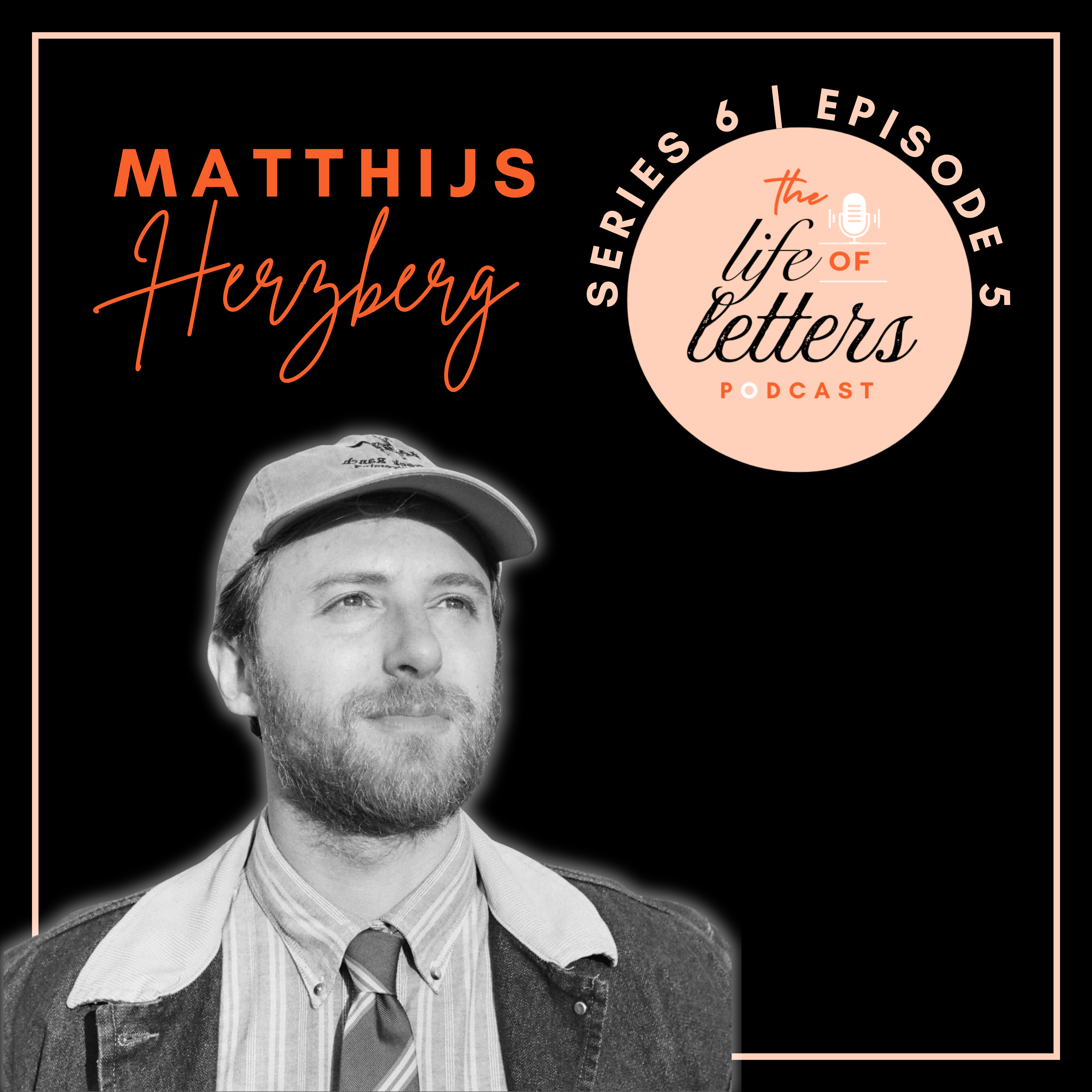
In today's episode, I'll be speaking with Matthias Hertzberg, Dutch by nationality, but based in New Orleans with his family. Matthias runs a foundry studio named Hertzberg Design Co. Where he draws lots of shapes, but predominantly letters for a range of projects and design briefs.
A huge welcome to the Life of Letters. Matthias, it's great to have you here.
[00:01:15] Speaker B: Thank you very much. Thank you so much for having me, Laura.
[00:01:19] Speaker A: It's great to chat and I want to kick things off with quite a big question, so let's see if you can distill this down into an answer. Why letter? Where did this all start for you?
[00:01:31] Speaker B: That is definitely a very loaded question.
That's the funny thing about letters is that we're exposed to them pretty much immediately. We learn how to read when we're four or five.
And I think most people kind of go their whole life, you know, using them without really thinking about them.
And it was probably going to be that way for me as well.
I spent my whole life pretty much drawing and I had a big interest in arts and architecture as a teenager. But I finished high school and I wasn't really sure what I wanted to do with my life, and so I started traveling and I hitchhiked around Europe for a while and then I got a ticket to New York City and I tried to do the same thing in the United States.
And it was somewhere in the US that I noticed a sign.
And I just thought, those are some pretty cool letters. What's up with those? And I started kind of imitating them myself in my sketchbook, trying to replicate them. And then I came to New Orleans and I met the woman who is now my wife.
At the time, I didn't realize that, obviously, and she had just taken a calligraphy class and she just showed me some of the basics of it and understanding why letters look the way they do and how much that can be traced back to the writing tools that people used centuries and millennia ago.
I think that really started for me wanting to learn more about it and starting to be like, wow, I love letters.
And ultimately I can't really tell you why letters are so awesome to me and to a certain subset of the population that I call my pears.
But yeah, it's what I really love about it is it bridges art and design or art and the technical side of it, which is a lot like architecture in that aspect. Like there is a utilitarian purpose and then there is a beauty and the aesthetic purpose. And I might be more interested in the aesthetic side of it if I compare myself to certain type designers who are maybe more methodical than I am, come more from a tech side, people who write custom Python scripts to do their kerning for them.
But yeah, I don't know, once it started, it got the ball kicked off and I could never stop drawing letters.
[00:04:06] Speaker A: Yeah, yeah, you got a taste for it. It's, it's always so interesting hearing where people's kind of spark of that kind of intrigue and curiosity around letters. So that' really interesting. I think it's, it's great. And I guess it's something that maybe somewhere down the line, I presume your, your style has kind of developed. How would you describe your style now? And has that evolved over time?
[00:04:31] Speaker B: It certainly has.
I've kind of made it a point always to not try to have my own style because I, I never wanted to lock myself into something and only do that.
So even at this point, people tell me, they come up to me and they say, wow, I love your style. And you know, I really, even at this point, I'm not trying to have a style. I think it is something that just kind of naturally comes to you.
When I first started, I was really into Victorian style, like really highly ornamental lettering. I still love ornament, but starting out I was there's a Sanborn Mapco or something like that was this company in the United States in the late 19th century, had produced insurance maps of just about every city in the United States. And every insurance map had this really, really beautiful ornamental cover with just the name of the city lettered super intricately. And it has all this cross hatching and curlicues and ornament around it.
And that was at the time when I first started drawing letters. Maybe 2014, 2013.
That was the pinnacle of the craft to me. And I mean it kind of still is to be Honest with you, but that's what I was trying to get to, like being able to just draw these immaculate ornamental letters. And I'd spent hours and hours cross hatching and stippling.
And I think it was around 2017 or so that I started going more towards the basics, like the foundation of the craft and realizing like, okay, texture, weight, contrast, these are things that I got to master before I can actually really do the stuff that I want to be doing.
I would say from there, my style, I think understanding the basics a little better and kind of taking a step back, looking, looking at the foundation of the craft, I think that's where I really kind of. It clicked for me. That's where my work got a lot better, in my opinion.
And so, yeah, stylistically I draw still from a lot of late 19th century, early 20th century stuff. That's always really a wealth of inspiration for me. I'm a huge fan of Art Nouveau and Jurgen Steel and all those movements of early 1900s Europe, because it is still really wild and ornamental, but it doesn't really have a basis so much in the classical stuff, which the Victorian and everything before that predominantly looked at the Romans and the Greeks as inspiration.
And I feel like Art Nouveau was one of the first times where it really broke loose from that and really started reconsidering what ornaments can be and what, what letters can look like too. And there's a lot of really wild Art Nouveau letters out there that are pretty hard to read sometimes aren't even particularly well designed, but are so completely unique from everything that came before it.
So I really love Art Nouveau, Art Deco, obviously, even though I haven't really drawn upon that in my work for a while now, and also at the same time the Arts and Crafts movement.
So I really love broad nib calligraphy. I love a good foundational hand. Edward Johnston, your fellow countryman. Yeah.
So again, to go back to the question of how I would describe my style, it's just a mixture of all the things that I find beautiful and interesting. But yeah, again, a lot of that is late 19th, early 20th century.
[00:08:13] Speaker A: Yeah, yeah, lovely. And you can see that in the work. And people should definitely check out your Instagram because there's lots of wonderful examples there.
And so there's a lot of your work is kind of designing letters and fonts.
But as we're exploring a bit of a theme around books this series, I just wanted to zoom in specifically on, on a project that you've done, which is around a book cover that you created. And I Wondered if you could just talk us through your process of designing for this, this project.
[00:08:45] Speaker B: Yeah, I, I have the book right here. It's called the Surgeon, the Midwife, the Quack. It's by Alana Skus.
I hope I'm pronouncing that correctly.
Also a fellow countryman of yours, English writer, published by English publisher. So, yeah, I was approached for this one with a fairly open brief. So it's about the development of medicine in early Renaissance England. So something that aesthetically kind of matched that. Yeah, so I did a couple of sketches for them.
All of it pretty heavily leaning on calligraphy.
I have always been very inspired by a guy named Helmut Saldan who was a book jacket designer in the Netherlands, mostly active between the 1950s and the 1970s.
And in my opinion, just one of the greatest lettering artists of all time. Just absolutely mind blowing stuff. He did a lot of calligraphy, but his actual book covers were always lettered. So I think he started off with the calligraphy, but he would then trace it just with a regular pen.
Because anybody who's tried this will know that lettering just gives you more precision than calligraphy. Calligraphy has a nice gestural energy to it, but if you want to just get really precise and really finesse it, you got to come in and draw the outlines of the stroke, so to say. So this was my first official commercial book cover project and I wanted there to be a bit of a homage to Helmut Saladin in there as well.
So the eventual letters that I did draw for them are somewhat based upon his work, not necessarily replicating any letters that he drew, but there is a very calligraphic, broad nib feel to it.
And then surrounding that, we have a bunch of ornaments, a canvas, and there's these little illustrations of old medieval Renaissance medical tools in there, syringes and shears and razors and what have you.
And yeah, I think, I think it all came out quite nicely.
[00:10:54] Speaker A: It's brilliant.
[00:10:55] Speaker B: Kind of a more contemporary color scheme to give it a slightly more modern look. I think that's always a nice challenge, taking something very historical feeling but still also making it feel contemporary.
[00:11:05] Speaker A: Yeah, yeah. And getting across kind of the essence of the book, I guess, on the, on the COVID which is always going to be a challenge when you're limited to the title and the space that you've got and all of that. But yeah, I think it's incredible. And so are you. Did you go through lots and lots of different phases with that? Do you start with the letters? Did you have to Move around the layouts and then start piecing together the illustrations afterwards. How did it kind of come together?
[00:11:34] Speaker B: Yeah, somewhat. There was definitely a couple of rounds of concepts.
I don't think we got too, too lost in the details. I think maybe after two or three rounds of revision, we did kind of nail it down.
Yeah, the initial concepts that I proposed, I think there was one of them that was pretty similar to the one you're seeing now, but there are also a couple that were quite different. I'm actually happy to share those sketches, but.
[00:12:00] Speaker A: Yeah, that would be great.
[00:12:01] Speaker B: Share those with your viewer. Sorry, with your listener.
[00:12:05] Speaker A: Yeah, we can put a folder together. And can you tell us then some other projects that you've done? Have you got some favorite projects that sort of stand out for you, lettering wise? Like, have there been some firm favorites in there?
[00:12:17] Speaker B: I think the work that I tend to find most interesting is my own retail fonts. Right. So as a type designer, there's a lot of different ways that you can make a living. And for most people, it's really a combination of ways. So I do client work, which might be, for instance, book covers. I do a lot of logos. I do custom typefaces.
Last year I completed a custom typeface for Foreign affairs magazine, for instance, which was really a hard text phase. Just meant for nice clean reading. Came out quite nice.
I think about is probably one of my favorite projects that I've worked on.
But yeah, I've done brand identity work.
I have done custom monograms just for people to put on a. On a ring, really. I'll do whatever people will pay me for.
I'm very open minded in that regard. But the retail fonts is another side of my business where I design my own fonts and I put them up on my website and people can buy a license to use them.
And what I really like about that is that it's more of a creative outlet. Because I'm my own art director. I get to decide everything about these fonts. Every little decision, what the pilcrow and the section symbol are gonna look like.
Every last bit of it is my choice. And so it's very creatively fulfilling, which not necessarily equate to it being commercially viable, but that's okay. I'm working on that.
I plan on releasing a couple of more usable sans serifs in the near future.
So as far as my retail fonts are concerned, I think the most interesting thing personally that I have put out there is a typeface called Mancini, which is a calligraphic Typeface, surprise, surprise. But it's based on a broad pen held with the left hand, which reverses the angle of the pen to about 130 degrees, which is the exact opposite of just about every letterform that you have seen in your day to day life.
So most fonts have their basis in broad nib calligraphy. If you look at Titan's New Roman, one of the most ubiquitous fonts out there, it is based on a broad nib pen held with the right hand. Same for Caslon and Garamond. And all those serif faces and even modern sans serifs can often be traced back to this broad nape calligraphy.
So reversing the angle of that pen, it's not entirely my idea actually. Shout out here to a type designer, Fedora Charles.
She is left handed and came up with a calligraphic script for lefties, which I saw that for the first time and it just blew my mind. Like, wow, this is so weird. This is such a cool concept.
It kind of looks a little Hebrew Y.
It's really hard to describe, honestly. I would just look it up. It's called Sinistral Hand and she has the whole guide to how to write it, how to make it yourself. If you're a left handed calligrapher, be sure to check this out.
Yeah, it's free on her website as a PDF.
So anyway, that concept really struck me and I thought about it for a long time and I tried to imitate her hand even though I myself am right handed.
So it was kind of a struggle for me. I kind of had to go through what left handed people always have to go through when they have to try right handed scripts, which is the vast majority of them.
You know, you have to turn your paper and write sideways or you have to put your hand in this weird kind of hook.
So anyway, I kind of put an art nouveau spin to that because obviously I love art nouveau and the result is just something that I think is very unique, very, very different from anything that's been made before. And that is really what I enjoy the most within the craft.
Because within letterforms there is only so much you can do before it's no longer a letter. Right.
You are bound to certain basic structures that our brains can recognize as their respective letter form.
And yeah, Mancini I think is an example of a typeface that really pushes those boundaries.
It is commercially a complete flop.
I have sold maybe 10 copies, who knows? No, it's on Adobe fonts where it's maybe starting to get a little Bit of use now, but, you know, again, that's not really the point. It is more of a creative outlet for me.
I would like to turn the retail side of my business to be a little more profitable than it currently is. Currently working on a website, actually, with a Scottish guy named Michael Hines who is very talented.
So I'm hoping that that will make things a little better.
[00:17:09] Speaker A: Amazing. And as you say, like, there's lots of different, different kind of streams for lettering artists and people who are dabbling in letters in all sorts of ways. But you've got that kind of client base work and then you've got the love of letters, which always those passion projects which you just never know what, what's going to take off and what isn't, I guess.
[00:17:31] Speaker B: And for what it's worth. Sorry to interrupt. For what it's worth, even if those typefaces themselves don't really sell, they do get eyes on my work. And so to that end, they are still great marketing materials, great promos.
[00:17:44] Speaker A: Yeah. And they're yours. And that's. That's really exciting.
If you're enjoying this episode and would like to support the podcast, you can donate a coffee. Every contribution helps us cover the cost of producing and sharing these conversations and allows us to keep bringing stories from the world of letters to your ears. You'll find the link in the show notes. Thank you for your support.
Now, let's get back to the episode.
And so with the, with the fonts that you're designing, are you starting them by. Are you sort of drawing these out? How's. How do you explore letters in that creative process? Are you doing it by hand? Obviously you're doing it by hand. Analog. Are you then kind of moving on to digital? How does that work?
[00:18:31] Speaker B: Yeah, I mean, contemporary type design is all digital.
There's just not really a market for lead type anymore.
I think there's a couple of very specialized people that are still cutting punches the old way or cutting it out of wood. For wood type, there's maybe somewhat of a market there because there are still printing presses. It is a niche, but.
But yeah, for me, it does often start as a sketch. I'll do a lot of sketching on my iPad. In Procreate, I used to do a lot of sketching on paper. I still do that sometimes, but not as much as I used to, which is a bit of a shame. I'm trying to draw more on paper again because it is really nice to do. It's more tactile.
Yeah, it does at some point or another move to the digital space.
Been using Font Lab for most of my type drawing career.
Starting to explore some different software as well. That's maybe a less interesting aspect of it, to be honest with you.
The software is just a means to an end.
But as far as ideas are concerned, it does usually start with sketching. Yeah, once in a while I am very confident in knowing exactly what I want to make and I can just open up my font editor and just start drawing the factors right away. And I am comfortable enough with it to do that, but almost always it does start with something else that I've drawn before.
So it's also pretty common for a font to start as a lettering project or a logo, which I really like. Or maybe it's a rejected logo. That's pretty common. Usually when I design a logo, I'll go through 10, 20, 30 iterations of exploring different letterforms and client only wants one of them.
But I might still say, well, this one actually does have legs, so I might explore that as a typeface. Recently I started a project that I'm calling Drawing a Font Every Couple of Days.
I think I did the last one two weeks ago. Yeah, it started with drawing a font every day and I think I managed two days.
And yeah, at this point I'm really slacking on it. But it has been a really fun exercise in seeing what works and just doing more iteration because making, like, producing an actual commercial typeface is a ton of work. There is a lot that comes into play there. And most of my typefaces have a character set that is at least 700 characters.
And some of those are what we call compound characters, like an A with an acute and an A with a grave accent and an A with a circumflex accent, you know, so those are fairly easy. But even so, it's. I'm still drawing 200, 300 different characters per style, right? So if I have a bold and I have an italic, then, you know, multiply it by that.
So my point is, making a typeface is a lot of work and I have found myself very often being like, okay, this is a cool idea, and then just throw myself into it. And then half a year later it's complete.
And I might say, well, maybe there would have been a better idea that I could have spent six months on.
So I was encouraged quite recently by a very good type designer named Lucas Sharp to just do more iterating and not just a sketch, but just turn it into an A through Z semi functional, very basic typeface and just see if it hits, see if you like it. And if you don't, fine, you spent a day on it.
And if you do, then great.
So, so far I've done nine of them, and at least one or two of them I think I will continue.
But it's been a really fun experience to just do more iterating and be a little looser with it, be a little freer with it without the pressure to spend six months on it.
[00:22:18] Speaker A: Right?
Yeah. And I guess that's the lovely side of not doing client work and actually having that balance of your own projects versus something that's, you know, a brief that's being prescribed, where you need to really lock in and kind of get all the things and the decisions and reach a point that meets an expectation. Whereas you can. You've got much more freedom of play and potentially even fuels your kind of artistic output when then you do come to the client work as well. Hopefully. We all hope.
There's two lettering terms that I'd love to explore a little more, and that's monograms and ligatures. Can you.
I kind of have a loose understanding of them, but can you just give us a real kind of explanation about what these two things are?
[00:23:14] Speaker B: Yeah, sure, Happy to. They're somewhat related because they are both terms for letterforms that are connected to each other. And so a monogram is a separate thing, Right?
It's a combination of letters. I believe, actually, that even a single letter can still technically count as a monogram, but it's usually two or three or even more than that, letters combined into one single lockup, ideally a nice lockup.
I've done quite a few for people's personal use.
People just like having monograms makes you feel fancy. I have my own monogram. You get it engraved in a ring, or you can put it on your stationery, or people use it for wedding invites.
A monogram is just a combination of one or more letters into one visually pleasing design.
Lots of things that you can do with that, but it's a standalone thing.
Whereas a ligature is something that you find within a font. And so a ligature is really any combination of two or more letters that are attached to each other one way or another.
So within type design, we kind of make the distinction between standard and discretionary ligatures. So standard ligatures are generally used to solve some kind of spacing issue or some kind of overlap issue. And that's been done since the beginning of the days of printing type. You'll find ligatures in Gutenberg's work.
So a very common example of that is the combination in Roman type of the lowercase f and the lowercase I, where often the f will clash into the dot, the tittle on top of the I. And so to solve that, you kind of connect the two so that the top of the f actually forms the dot of the I.
So if you look at a well printed book, you'll absolutely find that fi ligature in there somewhere.
And there's, you know, lots of variations of that. There's FJ or FF or FFI or FFJ, etc. A lot of text fonts will have a couple dozen ligatures like that. And those aren't really meant to be seen. Those are just meant to clean up some kind of spacing issue.
And then the discretionary ligatures are. They're more for aesthetic purposes. So historically, a very common one would be CT or st, where there is a little loop from the C to the T or from the S to the T.
And I think historically, one reason that those were used is because it would save a little bit of time for the typesetter. Right. Because the typesetter was placing all these individual little letters.
And then if you have a very common pair like CT or st, having those in one little piece of lead type instead of two separate ones, you know, save you a couple seconds.
I'm not sure if that's exactly why they were used. It's probably a combination of that and just aesthetic preference.
These days, ligatures like that are considered kind of eye dirt. Like, if you use those ligatures within a running paragraph of text, it's going to be distracting. And people are just like, why is that there?
Sentence? And all of a sudden I see this weird little shape and it interrupts your reading.
So those are really for headlines and display and that kind of stuff. And these days with digital type, there's a lot of different discretionary ligatures. People come up with all sorts of weird stuff, myself included. I love a good weird ligature, even though I know that most of the time they're not really going to be useful or usable.
But it can still be a fun way to kind of draw the eye towards whichever piece of text.
And I think one thing that people like about it, that graphic designers who use fonts like about it, is that it makes fonts feel a little bit more like lettering. It makes it feel a little more custom.
[00:27:15] Speaker A: Yeah, yeah. And you can play around a little bit and find opportunities, right, for where you might want to put one or Might not. Yeah.
[00:27:25] Speaker B: Similarly, a lot of fonts have alternates where you have maybe a different variation on a certain letter that's either a little simpler or a little bit weirder. You know, the options are really endless. You could do whatever you want. But very common is an alternate A and G, where a typeface may have what is called a double story AMG as a default.
So the double story of the A is the one where maybe a picture says more than a thousand words. Right.
[00:27:53] Speaker A: No, I want you to describe it. This is much.
[00:27:55] Speaker B: Let me try my best. So the double story A is the one that.
Let me start with the single story A. The single story A looks a little bit like an O with a little stem on the right side of it, whereas the double story A is the alternate variation where it kind of looks like the right side of an N lowercase n with a little ball on the left hand corner.
And then in the G, the single story G looks a lot like the single story A. Right. Where it has a big bowl and then a stem and then a little tail underneath it. Whereas the double story O kind of looks like a pair of binoculars. That one's easy to describe.
[00:28:32] Speaker A: Yeah.
[00:28:34] Speaker B: And so it's very common to have an alternate version of your A and your G accessible as a stylistic alternate within a typeface.
But again, it's just one way to give graphic designers. Yeah. That option of customization.
[00:28:48] Speaker A: Yeah. Wow.
Wow. I think. How does it feel when you see your work?
I guess you've seen it in all sorts of different uses, but when you see it as a book cover or as a website or wherever it goes, maybe even, you know, blown up. Absolutely giant. Like, what. What's that feeling when you see it?
[00:29:11] Speaker B: It is fun. I'm always appreciative. The feeling kind of varies by the usage.
[00:29:17] Speaker A: Yeah.
[00:29:18] Speaker B: Which sometimes is very cool and very impressive. And sometimes it's like a little flyer or something like that, or I've even seen my fonts used in memes, and, you know, I'm always like, okay, thank you for using my font, because that means that you gave me a little bit of money and you. Yeah, you know, that's. I always appreciate that.
Whether I'm gonna feel a deep sense of awe definitely depends on the project. Yeah. One really cool use that I saw a while ago is that one of my fonts, Schmaltzy, which is a black letter typeface, was used on huge banners in front of the Brooklyn Museum.
So seeing it like that, I'm like, yeah, okay. That is. That is Very cool.
[00:29:59] Speaker A: That's really cool.
Yeah. Oh, amazing. Okay, so last series we asked all our guests a challenging question. So I'm gonna ask you this.
What is your favorite letter of the Alphabet and why?
[00:30:15] Speaker B: Yeah, you prepared me for this question.
[00:30:19] Speaker A: How did you get on?
[00:30:24] Speaker B: A favorite is very often the uppercase B, especially in black letter A fracture B, which is absolutely gorgeous. But I don't think I can give you a single letter here that I'm going to be able to go with as a type designer to all my children. And you're asking me to pick my favorite child. And I just mean I have an uppercase M.
I love an uppercase Q. I love a lowercase G.
And I'm going to give you one oddball that probably none of your guests have given you. In Dutch, we have the ij, which kind of counts as a separate letter. It historically replaced the Y.
So in my name, Matthias, I have an ij, right, that's pronounced I.
And I've been having a lot of fun coming up with interesting versions of the I that, you know, that still work, but that definitely have never been drawn before.
And it's kind of a shame because I think a lot of Dutchmen don't really know about it these days. It's kind of become a little niche. So once in a while you'll see it. A good graphic designer knows about it and will use it. But very often people will just, you know, type the letter I and J separately, which technically works. It is readable that way. But ligating the two into one letter I think is really fun and interesting. And it's a very, how do I say, it's a very unique part of Dutch culture.
[00:31:57] Speaker A: Yeah. And a prime example of ligatures, right?
[00:32:02] Speaker B: Yeah, yeah, absolutely.
[00:32:04] Speaker A: Yeah. Oh, that's a great. That's a great answer. I knew you'd have one somewhere.
Thank you so much. This has been brilliant. And to find out more about you, people can Visit you at hertzbergdesign.com or at hertzbergdesign. Co on Instagram. But we will put lots of links in today's show notes and add some extra visuals as well so people can see things like the book cover and some of the fonts that you've. You've spoken about. And we'll put some links to some of the other resources that you've mentioned today because I think for all those left handed calligraphers out there and all sorts of things, that's been a really helpful signpost as well. So. Yeah. Thank you. Thank you. So much. Thank you so much for joining me and being a part of the life of Letters. It's been great talking to you.
[00:32:56] Speaker B: Thanks again for having me. It was a pleasure being here.
[00:33:01] Speaker A: Thanks for listening. Series 6 is made possible by my wonderful producer Heidi Cullop and the support of Speedball Art, whose commitment to high quality tools and creative tradition continues to serve, partner and deliver to artists all over the world. If you've enjoyed the episode, don't forget to subscribe, leave a review, or share it with a fellow letter lover. And until next time, keep listening, keep creating, and keep celebrating the life of Letters.