Episode Transcript
[00:00:01] Speaker A: Welcome to series six of the Life of Letters, a podcast exploring the art history and future of calligraphy, handwriting, signwriting and all things letter related.
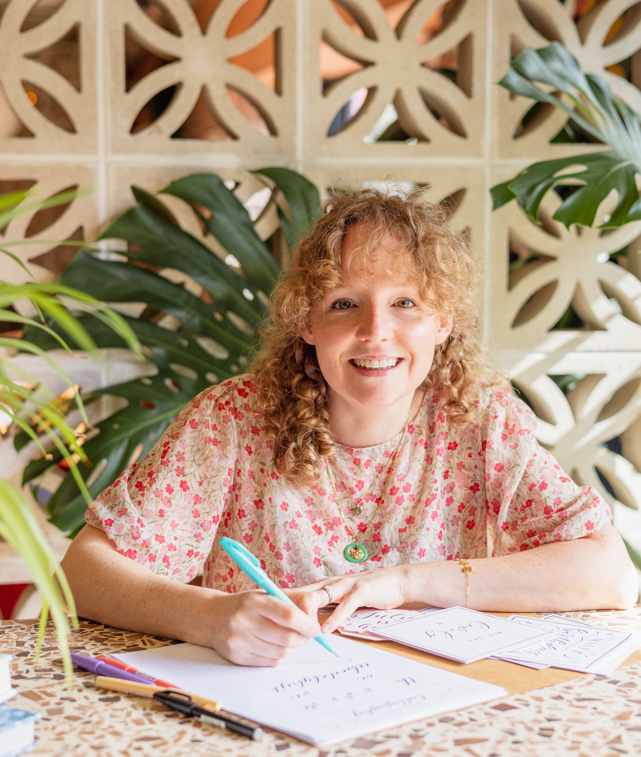
I'm your host, Laura Edrilyn, a London based calligrapher with a curious mind.
Six seasons in, I'm still fascinated by the stories hidden within the letters and the people who dedicate their lives to preserving, study, studying and creating them.
This season we're exploring letters through the lens of books, a library of letters if you will.
As we begin another season of conversations and discoveries. I'm delighted that the Life of Letters is once again kindly sponsored by Speedball art, champions of craftsmanship and creativity, helping keep the life of letters thriving across generations.
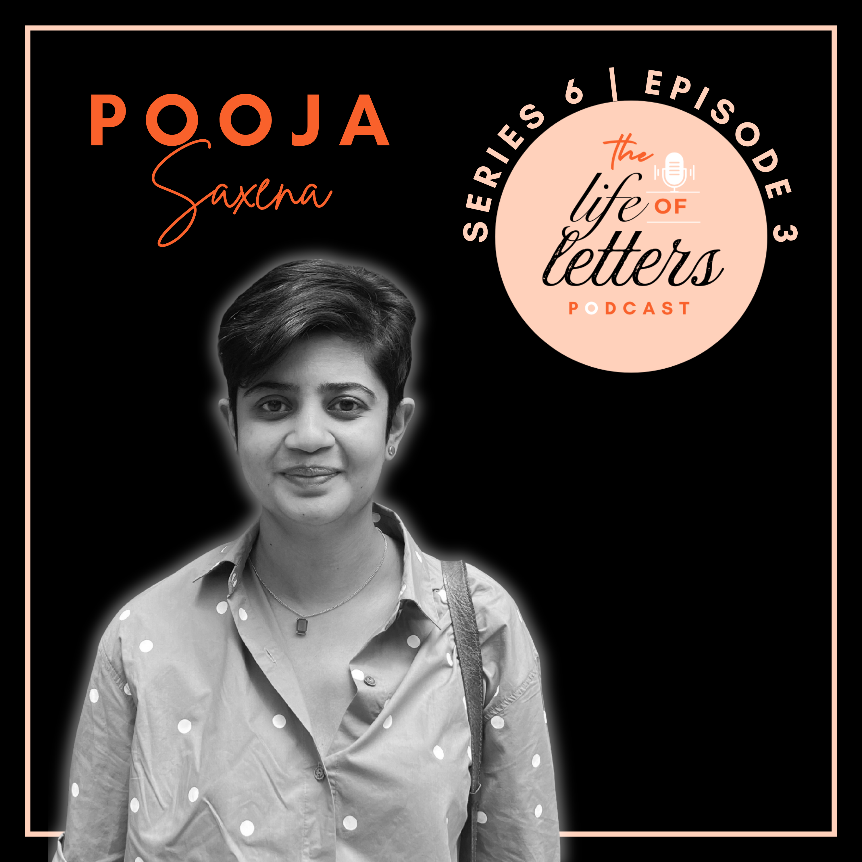
[00:00:54] Speaker B: In today's episode I'll be speaking with Pooja Saxena, an award winning typeface designer, lettering artist and typographer from India. She is best known for her design work with Indic scripts and her writing on locally rooted typographic cultures. Pooja is the author of India Street A Journey Through Typographic Craft and Culture and co editor of Primarium, Handwriting education across cultures and continents. She currently runs her independent practice Matra Type and works as a senior typeface designer and project manager at Type Together. Pooja, welcome to the Life of Letters. I'm so happy to have you here.
[00:01:31] Speaker C: Thank you so much. Thank you.
[00:01:33] Speaker B: It's so great to be talking to you.
The brilliant thing is we've got this lovely theme around books, this series and you've actually written quite a few as we've mentioned. Also alongside the two that we mentioned just now, you've done a lot of zines exploring kind of a kaleidoscope of science scripts. You've done the full on research side of it where it's the work like Primarium and looking at models of handwriting around the world. And then you've got your latest book which is focusing on the lettering and the kind of craft of typography in India's streets, which is incredible. What a wealth of things that we can dive into.
But where I'd like to begin is your own journeys into letters. Can you tell us a little bit about where that all started?
[00:02:20] Speaker C: So when I was finishing up high school, as I suppose one is expected to, I needed to figure out what I wanted to study, potentially do with my life and I was actually open to doing a lot of things. So the way it works in India is that you have to give these exams to get into various kinds of universities or colleges. It isn't just based on like your grades in the final grade of School. And so I, I think, decided to write, like, exams for being a lawyer and being a chef and being a designer. And at the time I had just kind of. I'd been learning French, so I thought maybe I could be, like, an interpreter at the United Nations. Like, I had, like, I was open to doing anything as long as it was interesting. But I think of all of those things, I think design was the one that drew me in most. And lettering specifically is not something that I thought I would do when I got into design school or, like, type design. Even though it had been something that I had done as a kid a whole lot, I just didn't think that it was a thing that, you know, like grownups could do for money.
For me, it was just a thing that I did for fun. My dad, who's actually an engineer, is an incredible letterer. And, like, my books from when I was a kid would have, like, these gorgeously lettered, like, inscriptions. And, like, he still does that if he'll give me a gift. And so I spent a lot of my time as a kid trying to, like, write beautiful inscriptions. Like, not just, like, good, nice words, but also, like, nicely drawn words when I would give a gift to, like, a friend or something. So I'd always loved it. I just didn't know it could be something you could do for a living.
And then after studying design, communication design for a few years went off, and I realized this thing that I've loved all my life could actually be my job. And. Yeah, and then I went and studied typeface design at Reading, and that was 15 years ago, almost.
[00:04:04] Speaker B: Wow, what a journey. Yeah, I love that. I think it's that realization that there's something that you're really interested in, actually be a career or a job or something that actually forms part of. Yeah. Your. Your. Your journey in the world of work. Right. I wondered if you could give us an introduction into the. The history of Indian scripts. And I know that's a bit of a big question, but maybe what are the key scripts that we should know about?
[00:04:32] Speaker C: I can try. So the Constitution of India lists out all the official languages that the state recognizes. And that list is, I think, about 22 languages at the moment. And I think 12 or 13 scripts are needed to write those 22 languages.
So those end up making the bulk of the scripts that get attention both in terms of. Because they have a large number of users, but also they tend to be scripts in languages that get state support for their development. And so these scripts would include everything from Latin which is used to write English, which is one of the official languages in India, but also Indic scripts. So Devanagari, Gurmukhi, Bengali, Assamese, Gujarati, Niti, Mayak, Old Chikhi, Kannada, Telugu, Tamil, Malayalam, and then Perso Arabic, which is used to write Urdu and Kashmiris. So it's actually a really large number of scripts.
[00:05:25] Speaker B: Yeah.
[00:05:26] Speaker C: And within that you'll see, I mean, there's scripts that belong to like the drama maker, the Indic families. There is the Perso Arabic, so that goes from right to left. There's obviously Latin. So I grew up and around Delhi, the capital of India. And that city itself has like four state languages and in four different scripts. So it would not be uncommon to see like a road sign which says the name of the street in English, in Hindi, which is in Devnagari, Punjabi, which is written in Gurmukhi, and in Urdu, which is written in versa of Arabic, which is. Which both feels extremely normal but, you know, can be quite a.
Can be quite a surprise for people if they haven't grown up in a place which isn't as multilingual and as multi scriptural as India can be. Effy?
[00:06:14] Speaker B: Yeah. Wow. And are you encouraged to learn all the different scripts or do you tend to just hone into sort of in kind of educational settings? Would you just learn one?
[00:06:25] Speaker C: That is such a lovely question also because there's so much like politics about it in the country. If parents tend to have resources, they tend to send their student, their kids to a school that teaches them English simply because it gives their kids mobility. So, you know, I went to a school where the first language was English. The second language that I learned was Hindi, which was the language, which is the Indian language that my parents, both my parents speak and I speak as well. And then technically you are supposed to learn a third language from the country.
And that's where it gets really messy because the choice of that third language becomes a political question. And like, I, for instance, am really disappointed that high school chose to teach me Sanskrit is my great.
Nothing wrong with the language. And all of that would have really loved to learn a third language which was currently spoken. Local languages.
[00:07:19] Speaker B: Yeah.
[00:07:20] Speaker C: Which like wasn't offered to me.
So it can. I mean, we're supposed to learn three languages in school and it really varies from state to state, I think, because so many people in the country speak Hindi and there's a lot of imposition of that language across the board.
I think you end up being at a great disadvantage if you're a Hindi speaker, because chances are you don't end up learning a third language because you can make do in a lot of situations if you know Hindi. So I have, like, I can speak some Punjabi and I can read it and I took lessons as an adult to kind of get better at it, but I don't speak any of the languages spoken in the southern part of the country. For instance, I can read a little bit of Kannada because I lived in Kannada speaking Bangalore for a few years. But, you know, it's been close to a decade since that happened and I've mostly lost my ability to read it. I can understand a bit of Gujarati and a bit of Bengali and I can read a bit of both of those scripts. But I would say there are people who easily speak three or four languages, which is just brilliant.
[00:08:24] Speaker B: Yeah, amazing. Amazing. And getting into the kind of technical side of these scripts, I'm assuming. I don't know that I should assume, but are they. Do they have a similar look or are they all very, very different? Like, are we looking at different. Completely different characters and symbols.
[00:08:47] Speaker C: Some of these scripts that look a little like the other one, but so, like, Kannada and Telugu look quite similar. Not identical by any means, but quite similar. Bengali, Gurmukhi and Devanagari all have a headline.
[00:09:01] Speaker B: Right.
[00:09:02] Speaker C: So the letters hang from that headline. So as a result, they can feel similar. Gujarati doesn't have a headline, but does function in the same way as these scripts. So there are, like, the essence of some shapes between Gujarati and Devanagari are quite similar.
The same can be true of Gurmukhi and the other two scripts as well. But I mean, you can't assume that if you know the Hindi Alphabet, the Devanagari Alphabet, you'll just see Gurmukhi text and it'll make sense to you. It's a little bit like Cyrillic in Latin. Right. Like, what is a lowercase N in Latin is not the same sound. And Cyrillic, it just kind of looks similar.
[00:09:39] Speaker B: Got you. Yeah.
[00:09:41] Speaker C: So you do have letters which can seem similar. You're thinking, oh, this must be this letter for the sound P, but it's actually letter for the sound S. Like, they just have somewhat similar shapes. So, no, they don't look like enough to be terribly helpful, I guess.
[00:09:58] Speaker B: Yeah. I was thinking, if you learned one, could you, you know, could you maybe adapt it in.
[00:10:04] Speaker C: That's actually easier. When it comes to language itself, they can be common words sometimes, but with scripts, structurally, they can be quite similar. In a lot of the Indic scripts, What you're expecting is that they're consonants and their vowels.
But when vowels get attached to consonants, they do so in the form of a mark which gets attached to a letter.
Like my name has the consonant B and J and then the U vowel gets attached to the B and the A vowel gets attached to the J. As opposed to in English where the vowels kind of appear as full letters. That doesn't happen. So that idea does kind of run through all the Brahminic scripts. So conceptually, if you know one, you can kind of follow what's happening, but again, at a conceptual level, not at the level of being able to understand what the words mean.
[00:10:56] Speaker B: Yeah, yeah, okay, that makes sense. And as a lettering artist, as somebody who's designing letters, are there particular scripts that you really enjoy working with?
[00:11:08] Speaker C: So I think more than enjoyment, it's also just the ones that I feel comfortable in. Latin? Yes.
[00:11:13] Speaker B: Dev.
[00:11:13] Speaker C: Nagri. Yes. Gurmukhi. Yes. Gujarati as well. I mean these are the scripts that I would design a typeface in and not feel completely out of my depth.
[00:11:22] Speaker B: Yeah.
[00:11:22] Speaker C: For some of the other scripts I feel comfortable enough to do bits of lettering. You know, a word is one thing, designing a whole typeface is quite another.
[00:11:31] Speaker B: Yeah.
[00:11:31] Speaker C: But I, I really, I really like Gurmukhi.
Like, I think it's also because it's a script that I spend a lot of effort learning as an adult.
I quite enjoy it. It looks just enough like Devnagri to mess my brain up.
Right. So like the proportions are just a bit different. So I constantly have to check myself in, not like kind of falling back on what is comfortable to me, which is the Devnagari. So it's always just a little bit of a challenge. So I really do enjoy working in Kurmukhi.
[00:12:03] Speaker B: Amazing.
And with the book that you've written where, what, what was the kind of motivation behind looking at Indian lettering?
[00:12:13] Speaker C: So it's, it's a funny thing. One of my first kind of, I mean amongst the first sort of, you know, class assignments that I got when I was in undergrad was actually to go around the city and like photograph signs.
And for some reason, like as whatever, a 17 year old and 18 year old, I thought that was like a stupid exercise.
I did not do it. I failed the assignment. I was like, whatever, good riddance. I don't need to be out in the heat with my camera trying to like photograph sign boards. This is stupid. And I didn't, I didn't bother for the next several years with anything to do with that.
Then as I realized that what I wanted to do, I had to do with the platform.
Maybe there is something. There is a point, you know, and so, like, I got a little bit more interested. I still wasn't documenting things or anything. It's when I decided that I wanted to study type design and specifically do type design in index scripts. That's when I started to realize how few resources I had to learn about not just how letters should be drawn, but also what people's taste and preferences are like, what kind of, you know, meanings are attached to different styles of letters as a result of usage, where they're used, et cetera. And then I started looking at whatever I could look at to be able to gather information, right? And street lettering was one of the easiest things, just in terms of its pervasiveness, but also that you can. You don't need a library card to go document it. You don't need to missions in an archive to document, you know, you just need to ask the person who runs the shop if it's okay. They can, you know, you can photograph the sign. That's it. So it's somewhat easy.
And especially after I came back to India from reading, by then I realized that the way that particular course and that particular department in reading shapes your practice is also a lot to do with.
It really kind of compels you to make your practice research based, to understand that whatever we are doing or looking at is in context. It's not just that, oh, look, such a piece of design. But think about why it looks the way it does. Does it have to do with production techniques?
Does it have to do with, you know, the medium or the material? Who commissioned it? For whom was it commissioned? Who drew it? What time did it happen? What other things were happening in the world? What other things were happening in the city where it was produced? Was it a time of social turmoil? The time of political change?
Once you start thinking like that, then you want to continue working like that. And with the absence of kind of formal archives that I was used to reading, it kind of became, you know, I had to build some of my own archives to be able to continue working like that. And looking at street lettering this way gave me a chance to do that. And it's only one of the things that I tried to do. Like, for instance, I have a massive collection of newspapers from around and, you know, I collect a lot of ephemera. So I just tried to gather as much as I could in terms of visual material so that I could then Start looking into it in the ways that I had learned in the hopes that it would just make me a more, you know, just a better informed, just designer.
[00:15:24] Speaker B: Yeah, yeah, I love that. And actually collecting kind of points of reference and absorbing yourself into a world of letters is only going to enhance that. Right? So, yeah, that makes. Makes complete sense.
[00:15:40] Speaker A: If you've been enjoying the life of letters, I'd love it if you'd hit subscribe wherever you're listening today.
[00:15:46] Speaker B: It's a simple way to support the
[00:15:47] Speaker A: podcast and make sure you never miss a new episode. And if you know a fellow letter lover, why not share it with them too?
Now let's get back to the episode
[00:15:59] Speaker B: and one of your articles that you've written, I want to say for I spy with my typographical eye. Is that your blog? Is that a blog that you've got or a newsletter? Yeah, yeah. And that delves into the kind of world of letters as pixels with the world of needlework, which is the article that's really stood out for me. And I wondered if you could share a little bit about your. Your favorite books on this subject, because I just found it a completely fascinating.
[00:16:26] Speaker C: This is, again, one of those things. I mean, one of the beautiful things about growing up is you realize how silly you were when you were younger, if that makes sense. Right. And I, and I write a little bit about that in the article as well. Just in terms of how, like, when I was a kid, I just saw needlework or knitting or embroidery as feminine work that didn't have the same value as other things. Like, I didn't want to be when I grew up, I didn't want to be a woman who was just doing, you know, quote unquote, housework. I wanted to be out in the world and have a career and all of those things, which is great, but not realizing that these other things have equal value, possibly more, because they have to be done in a way that isn't quite acknowledged or recognized by the world as, you know, either as labor or as creativity, which is terrible. So it, you know, I found my way and realized how valuable some of this work was, but also, I guess, kind of result of when I grew up and how I grew up is that I love pixel drawing. I love pixel lettering. I just love all of it.
And when it clicked in my head that, you know, the kind of monogram that your grandmother might knit on your jumper or like, you know, not that you see them anymore, but again, my grandmom would have, like, these, like, handkerchiefs with like, her initials embroidered on it. I mean, I guess people's grandparents had. Those were all lettering. I was like, huh, I never thought of that. And then once I got there, I became really interested in learning more and more about it. And this was the time when this, this tool called. Called Font Struct, I don't know if you're familiar.
Construct is a free online tool for making modular pixel typefaces. It's been around for years and I think it was somewhat new at the time. And as someone who wanted to study type design, I was like, huh, I'm going to make these really cool typefaces on Font Struct, right? As a way to learn. And the tool I kind of looked at to learn was that I'm going to first try and replicate these letterforms that I'm seeing in embroidery samples. And the book that I really kind of. And I found like a bootlegged copy online, right? Like, I didn't have a physical copy was this lovely, lovely book called A Handbook of Lettering for Stitches. And it was by a Swedish author called. And I'm probably going to butcher her name, Elsie, which I'm guessing, I'm saying, right.
I don't know how to say her last name. And I found like this PDF of the book online and, like, it was just amazing.
And it was just page after page of these beautiful, beautiful letter forms. So she had these spreads where she would do, like full alphabets in one style, but then also these pages which would just have like 50 different ways to draw the letter A and then 50 different ways to draw the letter B. And it went on and on and it was just beautiful. And it's just also, like, I do feel that since even since the time that I went to university to now, the world has changed quite a bit. I think. There was also just a lot more kind of. Maybe it's coming back to now, though. There was a lot of, like, sexism just in everyday language that, you know, maybe we've gotten a little bit better at. I also went to study type design when I was really young. Like, I think I was 21 or 22. So I was the youngest in my. Amongst the youngest in my class and I'd come from India and all of those things. And I just felt that, you know, knowing that women did all of this great work kind of helped me carry myself in the world, if that makes any sense.
[00:19:57] Speaker B: It does, it does. And there's a. There's a sort of lineage, right? There's this amazing past of. Of People creating letters in various art forms. And I think. I think you're right. It opens up your mind sometimes when you dig about in the past.
[00:20:15] Speaker C: Exactly. And so it just. Yeah, it just made it easier to be myself.
So. Even though, I mean, it sounds really grand when I put it like that, but it really did, you know, And I. It really did. And it was. It was super nice. And when I was at reading, I. I discovered, like, more material like that. There was a French kind of company that did, like, these embroidery samplers. They're called Maison Szechus, and they would have, like, these booklets, like, these accordion booklets, and they would have, like, seven or eight styles in each one of them. And those are beautiful. So, you know, once I got a job, I started collecting some of those. I managed to, you know, actually buy myself a copy of that book.
[00:20:51] Speaker B: Oh, amazing.
[00:20:53] Speaker C: Just like my PDF book, like, copy. But no, it's been quite lovely. And now, like, you know, I'll grab, like, a embroidery sampler if it has letter forms, like, in whatever flea market I find myself in.
[00:21:05] Speaker B: Yes. A collector of letters. I love it.
I love it.
And it really does. It opens up your mind even as we're talking.
[00:21:13] Speaker C: And, you know, the funny thing is that I've been doing these workshops and typeworks the last several years, and whenever the subject of pixel letters come up, you know, I always ask, like, the group that is around, you know, like, what do these remind you of? Like, if we see, like, a tiled sign, which is the same way, Right. It's set in, like, a bitmap grid. It's pixel letters. And, you know, like, almost always the men will be like, video games, and the women will also say video games. And I was like, think. You know, think further in the past. Think further in the past. And I've done it, like, half a dozen times, and not a single time has a man been able to figure out that this looks like embroidery.
You know, after a couple of prompts, it's always. One of the women in the group will be like, this just looks like cross stitch.
[00:21:56] Speaker B: Yeah.
[00:21:58] Speaker C: And it's so funny because it's just a kind of visual language that women are familiar with or women have paid attention to, but even today is not as common, you know, an activity for boys.
[00:22:10] Speaker B: Yeah.
[00:22:10] Speaker C: Unfortunately for them, I guess.
[00:22:12] Speaker B: Yeah.
Well, maybe bringing this back into people's minds and actually raising that awareness makes sense.
[00:22:18] Speaker C: Is it like a British Olympic swimmer, a young man who knits? What's his name?
[00:22:23] Speaker B: Tom Daly. Yes, he does. Yeah. We need to encourage him to bring some. Some letters in. I'm pretty sure he does do words,
[00:22:30] Speaker C: but he's listening to this podcast.
[00:22:32] Speaker B: Yeah, we'll have to get him on. Talk to him about getting letters into knitting. Yeah, and you're right, you know, I think it's. It's.
There's more and more interest in coming back to some of these older art forms. I say older, I mean, more analog art forms as well. But they can be this wonderful bridge between the two. Right. The digital world and both of them. And yeah. Removing the sort of gender stereotype as much as we can for. For kind of people wanting to delve into pixelated letters in all ways.
[00:23:03] Speaker C: Somewhat new book. I mean, I say new, maybe a few years old, which is called. Which is about knitting patterns and letters.
[00:23:09] Speaker B: Oh, nice.
[00:23:10] Speaker C: And. And I think I do mention it in that article that I wrote quick. And I'm completely forgetting its name at the moment. It's called Typographic Knitting, and I think that is written by a man.
[00:23:23] Speaker B: We're unlocking. We're unlocking it. Yes. Amazing. I will put a link to some of these things as well and talking about the kind of the future as well, and this idea that although we're sort of digging around in the past and bringing some new, well, old things into the new, but in a world where there's obviously a lot of communication and it's vast and it's fast. What's your sort of hope for the future of Indian scripts particularly?
[00:23:47] Speaker C: That's such a great question. Another big one. So many hopes and dreams. So to start with something really, like, practical, I. I hope that sooner than later there is some. Some kind of parity in how much fonts for Indian scripts cost and what people can actually afford. I think a lot of times, I mean, and I'm as guilty of it as anyone else, the typefaces we design tend to be for people who are as privileged as me, who can spend that money in buying a typeface, which means that, you know, the local mom and pop shop, if they want to do a sign, they can't actually afford to buy anything and they have to depend on something free. And some free typefaces are great, but not all of them. So I do wish that, you know, we find a way to make the work that is actually happening available to the people who live in the country and actually use those scripts on an everyday basis. I think that's a gap that even with a lot more indic typefaces being released in the last decade, decade and a half, I don't think that's a gap that's really been bridged.
I don't. I mean, so that's, you know, like an economic dream. I suppose what I would also love is for there to be more indictive phases that don't start off as extensions of Latin ones. And again, I suppose this is, again, an economic one, right? Because extending an already popular Latin typeface family probably not. Probably is most definitely a more financially secure choice to me. But what that also means is that a lot more resources go into sort of reproducing in the Indic scripts, you know, the taste and styles of another script, as opposed to being able to invest in typefaces which, you know, are a continuation of the stylistic or the cultural lineage of any of these scripts. So I would very much love to see more of that because. And I think both of those things really combine, turn into the. Was the bigger, more universal dream, which is just that, yes, communication is fast, but can it be more expressive and can it be more accurately rendered in Indian languages and scripts? And I think for that, we need more interesting typefaces. And two people should be able to buy.
[00:25:49] Speaker B: Yes.
I love it. I love it. Hopes for the future.
Pooja's taking this on. I like it. And, yeah, what wonderful, wonderful place to sort of leave it in our mind in terms of the opportunities where you can bridge those gaps. And they're all kind of things that sound fairly achievable, but, you know, you need everybody to the collective to get on board.
And last series, we asked a challenging question, which we're going to ask again. It's becoming our little mantra at the end.
What is your favorite letter of the Alphabet and why? And obviously for you, you've got quite a few.
Of course.
[00:26:30] Speaker C: Can I answer in multiple scripts, please?
Okay, so in Devanagari, my favorite letter to design, which also, like. I both love designing it and absolutely hate designing it because, like, it can feel like such a pain. Is this conjunct form for the sound?
And, yeah, so it is a combination of the letter K and the letter. So that's the one that I really, really like in Devanagari. In Gurmukhi, the shape that I really enjoy drawing is the letter which represents the sound L, which is like the sound L. That is one of my favorites.
[00:27:06] Speaker B: In that script, does it look very different to an an L in Latin?
[00:27:11] Speaker C: Yeah, L is just this, right?
[00:27:13] Speaker B: Yeah. Very boring. Yeah.
[00:27:15] Speaker C: Yeah, very boring. This. This one.
Considerably more.
Okay, I don't want to say complicated, but considerably More strokes to get this shape in order.
[00:27:24] Speaker B: Okay.
[00:27:25] Speaker C: It's a shape that I really like. It has both, like, it has like.
Like a corner, but it also has round shapes. It just has a lot going on in terms of variety of shapes, which I really enjoy.
And I think in Latin, I think I actually really enjoy drawing the uppercase A.
Yeah.
[00:27:45] Speaker B: Uppercase A. Yeah.
[00:27:46] Speaker C: I think maybe I just like pointy corners.
[00:27:49] Speaker B: Yeah.
[00:27:49] Speaker C: But no, I. I enjoy the letter E.
Yeah.
[00:27:54] Speaker B: Love. Lovely. And there doesn't have to be a reason why, you know, sometimes we're just drawn to these things, literally.
We'll have to get some images of the first two, because I'd love to see those. We'll have to have a look at them there because I think it's lovely to see these different characters and letters as well from all sorts of different places around the world. I think is. Is beautiful, especially when actually one single place has so many different scripts as well. Like, what a. What a rich and. And kind of div.
Place to live. So, yeah, that huge thank you to. To you for obviously, even creating these books and being part of the wonderful
[00:28:30] Speaker C: world of books is super fun. I mean, I wish I could do more of it.
[00:28:36] Speaker B: Are there more in your. In your kind of future, do you think?
[00:28:40] Speaker C: There might be some stuff.
[00:28:42] Speaker B: Yeah, that's all.
[00:28:43] Speaker C: We're also, like. I do want to give a shout out to the Alphabets book that has just come out. I don't know if you've seen Alphabet Soup. Alphabet Soup, Yeah, I have. I mean, that's a book by the group Alphabets, which is like a group of designers, typeface designers, lettering artists who identify as women.
And it's a beautiful, beautiful book that's just. Just come out, and you should check it out.
[00:29:09] Speaker B: I'm 100 gonna check it out. Yes.
[00:29:12] Speaker C: And some drawings. But so do, like, I think I want to say almost a hundred. Definitely many dozens of, you know, designers from around the world.
[00:29:22] Speaker B: Yeah. Amazing.
And a previous guest, Chris Camper, who's on series five with us, is one of the alphabets.
[00:29:31] Speaker C: And this is fellow Alphabet.
[00:29:33] Speaker B: Yeah, she's a. She's a fellow Alphabet. And this is B, E, T, T, E, S. For anybody who's kind of wondering how to find this without just getting lots of alpha. Actual alphabets. Yes. I will put a link to that then, as well in the show notes. Are you doing lots of book tour activity at the moment?
[00:29:48] Speaker C: No, I did a bunch in India before I came. I traveled to. I did five events over four weeks. It was nuts.
[00:29:56] Speaker B: Wow.
[00:29:57] Speaker C: But it was also absolutely lovely. And then I'll do a little bit of traveling in this continent, I think in the summer, maybe a couple of online events as well, and then back to India later this year and do some more events.
[00:30:09] Speaker B: The life of a lettering artist and, and typographer.
[00:30:12] Speaker C: Spending all their money traveling, just all of it. The rest of it buying books.
[00:30:16] Speaker B: Hey, it's the perfect life. Exactly. Yeah. Oh, it's so lovely to talk to you. So to find out more about you, it's matratype.com and you're @matratype on Instagram. But as always, we'll put lots of links in today's show notes. But just a huge thank you from me and, and from all the listeners. But thank you so much for being part of the life of Letters. It's been so such a lovely conversation with you, Pooja.
[00:30:43] Speaker C: Thank you. I love the name of the podcast, so I'm like doubly pleased to be on.
[00:30:48] Speaker B: Yes, yes, thanks, Pooja.
[00:30:51] Speaker C: Thank you.
[00:30:53] Speaker B: Thanks for listening.
[00:30:54] Speaker A: Series 6 is made possible by my wonderful producer, Heidi Cullop and the support of Speedball Art, whose commitment to high
[00:31:01] Speaker B: quality tools and creative tradition continues to
[00:31:04] Speaker A: serve, partner and deliver to artists, artists all over the world. If you've enjoyed the episode, don't forget to subscribe, leave a review or share it with a fellow letter lover. And until next time, keep listening, keep creating and keep celebrating the life of letters.