Episode Transcript
[00:00:02] Speaker A: Welcome to series five of the Life of Letters, a podcast exploring the art history and future of calligraphy, handwriting and all things letter related.
I'm your host, Laura Edrilyn, a London based calligrapher with a curious mind. Continuing this journey to connect with artists, historians, experts and letter lovers all around the world.
As the podcast grows. I'm so grateful that this season is once again kindly supported by Speedball art, champions of craftsmanship and creativity, helping keep the life of letters thriving across generations.
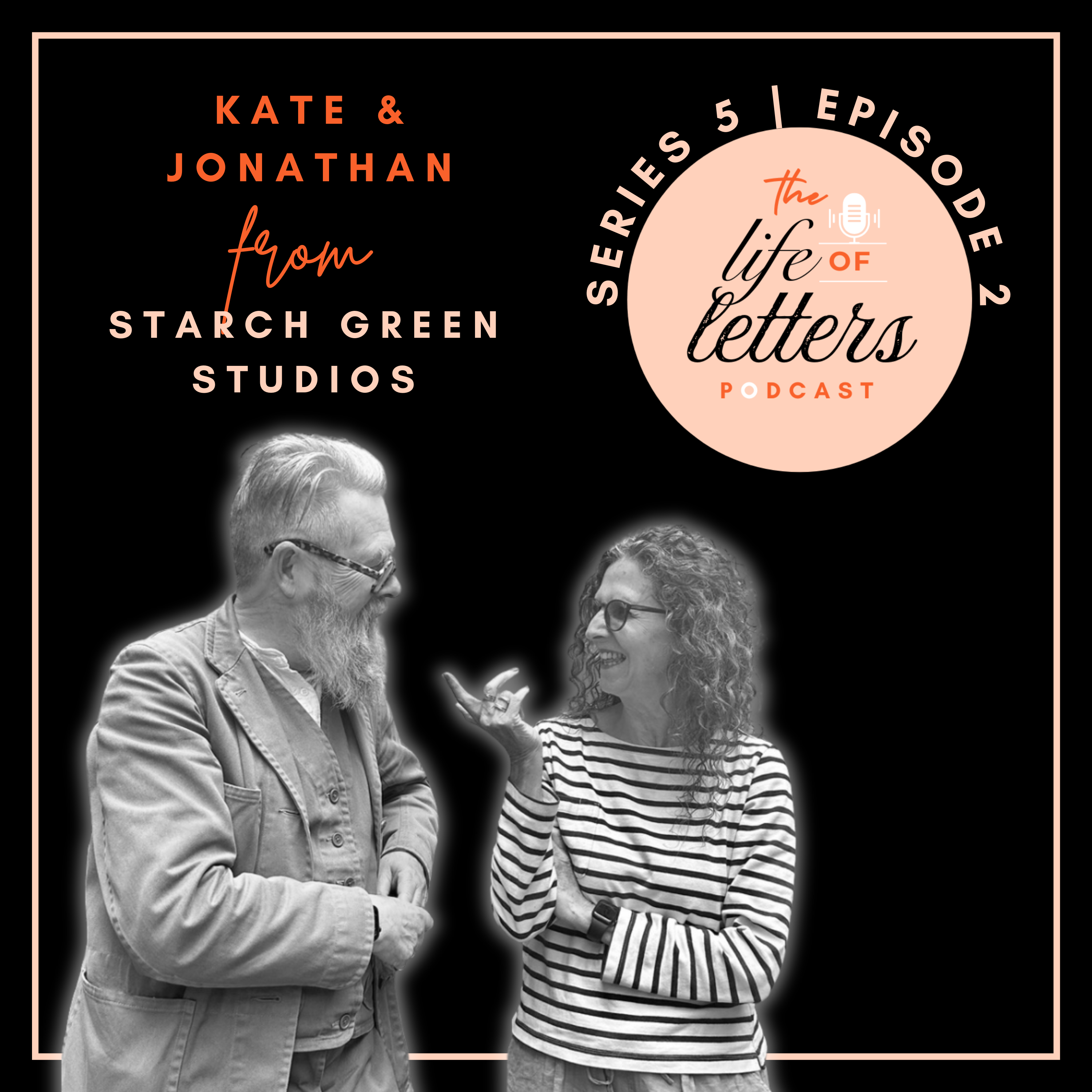
[00:00:39] Speaker B: In today's episode, I'll be speaking with two guests. The design studio Starch Green, founded by Kate Fishenden and Jonathan Mercer. Kate studied graphic design at St Martin School of Art when casting off type was a thing and there were no Apple Macs. Jonathan went to Kingston Art School where
[00:00:56] Speaker A: he studied furniture and product design.
[00:00:59] Speaker B: They met when working at a leading London design agency. Jonathan spent 10 years as an illustrator devoted to wood engraving before they both worked together again in brand strategy.
Now at Starch Green Studio, they work together on design projects and create fine art prints, letterpress and silkscreen. They open their studio for artists at home each year. Kate and Jonathan live in Starch Green where they brought up five children and have a small Italian greyhound named Pesto. And I'm fortunate enough to be practically neighbors and live within the community.
They are true pillars of championing the artists and local businesses in the area.
So firstly, a huge welcome to the life of Letters to both of you.
[00:01:40] Speaker C: Hello.
[00:01:41] Speaker D: Hi.
[00:01:42] Speaker B: Your bio actually takes us on a bit of a journey where your creative lives kind of weave in and out.
But I wanted to see if you could just tell us about that moment where you decided Starch Green Studio needed to happen.
[00:01:57] Speaker C: Decide who speaks.
[00:01:58] Speaker B: Yeah, that's true.
[00:02:00] Speaker C: Yeah. Well, I suppose what was interesting. Yes. We'd worked together at design companies years ago and I've always drawn. Jonathan's did a lot of wood engraving and then we worked in brand strategy for quite a long time. And in around 2010 we thought, well, Jonathan's got all these old wood engravings sitting around that I hadn't looked at for years.
Could we repurpose them in some way? So our first idea with with Stil Art Screen was to create and reuse the wood engraving. So one, make them available as prints and secondly to use them in patterns and on ceramics. And we toyed with, well, we did some textiles, we some cushions. So it's sort of a bit of screen printing then and created almost a little mini brand based on these wood engravings. And that kind of started off,
[00:02:48] Speaker D: we
[00:02:48] Speaker C: were both Working full time as well. So just to keep us on our toes. So that was fun. And we did artists at home quite early on, which was just Jonathan because that all the. You can only be one artist, you can't be a thing.
So he was the artist. I wasn't. I was just a tech technician and designer, you know.
[00:03:06] Speaker D: You're a sales.
[00:03:07] Speaker C: Sales rep, store woman. Yeah, it was. So that was quite fun. So we were all both together here, you know, when we opened up. But it was. Jonathan was the artist and that was. And then from over the years we realized that wanted to do more things.
We enjoyed the ceramics. But you don't make any money doing it.
Although, you know, not really not making money, not probably just costing us money was more. More the issue.
And so that was fun. And then I suppose over time we've developed into more of design studio and the less brand strategy we did, the more we were picking up more design work because as brand strategists we used to commission all design work. We didn't do any ourselves.
And so then more lately we've become, as you said, more interested in the community.
We do local work for local people. So the brands and our designs we've done lately we focus on things we can walk to and we can meet for a cup of coffee and talk about a project and do it like that. So that's. Now we do more design than anything else. And I, or obviously I've started doing prints as well, which don't stick to that user wood engraving theory. They're actually new drawings and new prints. And so I also when we do artists at home, there's two artists here, but we combine it all under a sort of starch green umbrella.
[00:04:34] Speaker D: Yeah, but starch green was kind of a retirement plan.
We thought what are we going to do when we stop doing what we're doing?
And obviously we looked around at all sorts of things and it seemed like fun to sort of take some of the old stuff and do something with it, which we sort of never had time to do at the time because it was a long time ago. Yeah, but that's just the. Yes. People's, you know, generationally go through lots of different jobs and work and stuff and that's kind of what we've done. But we've sort of ended up a little bit like where we started, so.
[00:05:13] Speaker B: But much older and wiser.
[00:05:18] Speaker D: Yeah, don't know about that.
[00:05:19] Speaker B: But yeah, you have a studio, which I've been to, and it's beautiful and it's sort of filled with the most wonderful materials and tools. And inside you've actually got three letter presses and a selection of type. And I wondered whether you could kind of talk about what exactly you. You have in there, why you have it and where did you get them. Give us everything.
[00:05:49] Speaker D: Because we've lived in this house for 40 years now, we started off with a small shed which was just a sort of storeroom that held lots of stuff, all the stuff that we'd accumulated in that sort of previous Illustrator life. And then I added an extension to it. So this is a very tiny shed.
[00:06:10] Speaker C: Six by four.
[00:06:11] Speaker D: It was a six by four shed and I added a. A four foot extension to it. It was very rickety and it allowed me just to squeeze in and sort of do some wood engraving and print there. So we had.
We've got all together. I mean it's. They're small. They're very small printing presses. So people probably imagine they're very large things and our studio is large. It's not. It's quite a little studio. And these are desktop printing presses.
So that they're the size of a, you know, a small inkjet printer really, but they're just much older and very heavy.
Or at least the. The Adana, which is the sort of Albion. Sorry, the. The Albion which is the. The what I proof things on, which is a cast iron desktop press, which weighs too much for me now and. Too much.
[00:07:09] Speaker C: I think it was always too much for.
[00:07:10] Speaker D: Yes, it's at least a two man job, but.
But yeah, I used to be able to, you know, lump it around, but now it's. But it sits on the desk. That's fine. And. And then there's two little Albions which are made of aluminium and they much lighter.
Sorry.
[00:07:27] Speaker B: So there's an Albion, one Albion and two Adanas.
[00:07:30] Speaker D: Yeah. So the Albion's very old.
[00:07:32] Speaker B: That's right.
[00:07:33] Speaker D: Kind of. That's a 19th century press and get all sorts of sizes. So you can get ginormous ones that would print newspapers, but you also get little tiny ones and this is one of those.
And I got it 40 odd years ago.
We went off to I think Crouch End to.
[00:07:55] Speaker C: We saw it advertised in Crouch End.
[00:07:57] Speaker D: Exchange and Mart.
[00:07:58] Speaker C: Yeah.
[00:07:58] Speaker D: Do you ever. Do you even remember Exchange and Mart
[00:08:00] Speaker C: now it's probably bought everything.
[00:08:02] Speaker D: Well, Exchange and Mart was like the Internet or Vinted or.
It was the exchange of Mart. You could buy cars, you could buy tractors, you could buy ebay.
[00:08:15] Speaker B: Yes, but in person.
[00:08:17] Speaker D: And Amazon. Yeah, it was a newspaper came out every week and you go and Buy your Exchange and Mart.
[00:08:23] Speaker C: You'd ring them up and say it
[00:08:24] Speaker D: and they were like classified ads and it was all in sections and you'd find, you know, I don't know whether there was a printing section, but anyway, we found an Albion on there and went to someone who had it, you know, up in their third floor or something. We had to get a friend to carry it down and put it in the back of our car and, and bring it home and up another three floors, up another three floor. We had a flat in Belsize park which we had to get it back up there. So once it's there it's fine, but it's. It's just a bit heavy.
[00:08:56] Speaker C: Yeah.
[00:08:56] Speaker D: So the Albion is a sort, is a. Is a definite 19th century. And I, I don't know the exact date of my press. I sort of, when we do artists at home, I, I tell the same story over and over again because people want to look at it and I say, oh, it's about 1840, something like that. Which is probably about right.
Whereas the Adanas were a company very sort of Second World War, not much materials after the war. And some clever guy invented this little printing press, semi automatic printing press with a handle that would print and.
Made out of, made out of Spitfires, probably. It was just, you know, old bits of aluminium that they melted down and made a printing press. And it, it sort of, it's lighter, it's very light and you'd find them in the 50s and 60s in every office.
They were like, if, if people had to do a business card or a compliment slip, all that sort of paperwork before you had photocopiers, people would have an Adana and they'd make up a little bit of pipe and they print their compliment slips.
[00:10:07] Speaker C: So one of them comes from my dad's old office. He actually, he must have used it in the 60s and when he cleared that out, he had it in the house. He said, would you want this? We're like, yeah, yes.
[00:10:21] Speaker D: And then we acquired another one and, and the trouble is they are.
They're sort of like collectible.
People get a bit of, a bit of a thing for them and start buying them. Don't know why, they just do. They're so we've got a couple and I, you know, we switch between them and you can still get parts. It's kind of crazy. There must be a, you know, there's a shed somewhere with old parts and.
[00:10:47] Speaker C: Well, there was a wonderful Adana shop on Gray's Inn Road.
[00:10:49] Speaker D: Wasn't It.
[00:10:50] Speaker C: I don't think it's still there. And that did have the most wonderful lettering on the tie, on the fascia. It had a fantastic logo with an A that curved in bit like the shape of the press.
[00:11:00] Speaker D: And they would sell you all the sort of requisites you needed for rollers. And they had type. So this was back in the day of movable type. So they had Stevenson type. And we bought a font of Caslon. This is our first thing. We buy our own font of Caslon and used that for years. And so a lot of my sort of design work that I did as an illustrator, I would use Caslon because it sort of went together and you learn about Caslon and we still got it. And then gradually we accumulated other types. They had a standard, sort of really horrible typefaces that were presumably out of copyright or something, but you could order monotype fonts. So we got a gil.
We got a lot of different sizes of Gil. Gradually. Although you'd only get it. You'd get. A font would be. Would have like six E's.
So you'd have to, you know, a font would be a little pack and you'd have six E's and four A's. And so you'd have to, you know, whatever work you did, you had to
[00:12:10] Speaker C: sort of write the copy to write
[00:12:11] Speaker D: the copy to fit.
Or you bought another font, you know, and it was like 10 quid. And you'd get a little packet in the post and you'd.
[00:12:18] Speaker B: And you could use some more words with ease. In. Yeah, yeah.
[00:12:22] Speaker D: So you then start realizing that type is. You end up with these huge cabinets full of type, which is.
And then the worst thing is you have to put it away after you've set it so.
[00:12:35] Speaker C: Which is where the mind appease. And Q's comes from, allegedly, because P's and Q's because it's all backwards.
If you then have to dismantle the tight and put them back into the right place on the box. And the P's and Q's look very. You know, you could get them the wrong way around because they were backwards.
[00:12:52] Speaker D: Yeah.
So as a compositor. As a hopeless compositor. Yeah. I have various blocks of type out there that I've not put away because it's so boring.
And you have. And for spaces, you have five different sizes of spacing.
And my eyes. Now you're kind of. You have to do it by feel, really. You get this. But as you sort of clean it and you get the. The type apart, you've got the spacing which in order to kind of tweak it, you've got all sorts of bits of space and fag papers and things like that to just make it work. And. And then you've got to distribute it on your.
In your type drawer.
[00:13:33] Speaker C: So the bought. The boring distribution thing is supposed to be a lot of the mud larkers along the Thames. There's a lot of type around Fleet street because the compositors couldn't be bothered to put it back. So they put it in their pocket and then as they were walking home, they just throw it, throw it in the river.
[00:13:49] Speaker D: That would save them an hour in the evening, you know, just throw the type away. Because it was every. If it was a newspaper or anywhere that had.
Were making type, they'd have a liner type machine or something and they'd be knocking out this, you know, they'd be knocking out type. So it was as easy to throw it away as to put it away. And they'd have buckets.
[00:14:09] Speaker C: It's going to be a block. So then you can just re. Melt it.
[00:14:12] Speaker D: And I. I think they used to get apprentices which would. They give them a bucket of type and say, can you put that away?
And it would be mixed type faces, type sizes, and it would be like a nightmare. But you'd learn about type quite quickly, I think.
[00:14:29] Speaker B: Yeah, I bet.
[00:14:32] Speaker D: So, yeah. So our shed, such as it is, we got three presses on the desk and various bits and pieces which it sort of comes out for show.
[00:14:46] Speaker C: Don't do so much in there.
[00:14:47] Speaker D: Don't do so much now because it's. It's very little and it's sort of harder to see and. And as I said, mostly you do it by feel, in fact. But yeah, it's still quite taxing, young man's game and.
[00:15:04] Speaker B: And cleaning it. Right. I presume you've got a clean spirit,
[00:15:08] Speaker D: white spirit, and you. You blob it all over so it's. It's permanently sort of slightly inclined. Inky. Yeah, everything is slightly inky to do with printing. Everyone has rags in their pockets and they're kind of constantly wiping their fingernails. Black fingernails, and it's not a very long.
[00:15:27] Speaker B: Yeah, exactly. Are there any presses that you would love to get that you haven't got?
[00:15:34] Speaker D: I think we did just think about when we started starch green and we started thinking, you know, megalomania. All right, we're going to turn this into a big thing. And I thought, wouldn't it be interesting to get a big press? Wouldn't it. And we sort of. You idly look around and they are for sale.
They weigh a ton and you need a print engineer to kind of bring it to you. And then we realized you couldn't even get it down into our. We've got a basement that you'd have to come in our.
And you'd need to reinforce the floor.
[00:16:11] Speaker C: We did think about having it in the sitting room.
[00:16:13] Speaker D: It was a thought. And you start. You're sort of looking at your floor thinking, you know, I wonder what it could take.
[00:16:20] Speaker B: How far could we push it?
[00:16:22] Speaker C: Exactly.
[00:16:22] Speaker D: And you think, well, because they look lovely, you know, it's like these very rich people who have basement garages with their Ferrari sitting there, you know, and they have their lounge next to their car so that they can look at it. It's a little bit like that with a printing press. Yeah.
Buy them for £10,000 or something. These big, you know, the big. Or you get Colombian, which has got like the eagle on the end of the weight, which is very spectacular. Well, there's. There was kind of two.
I mean, there was lots of different people made printing presses, but there were the two sort of brands of the time. In the 19th century, you'd have Albion, or the Albion style of press, which had a big spring in the pillar. So you'd have a pillar and a spring. And so when you'd crank the arm to get a press out of it, the spring would sort of pull it back again. So you'd have a spring and then you. And that was the Albion. And these were the workhorses of printing. You'd have all sorts of different sizes and they were kind of bulletproof.
And I was told in the 80s that they were all being sold and sent out to China because China was going through its industrial revolution. I don't know if it was true, but I think they went out in containers somewhere and they're very robust and sort of. Anyone with a basic sort of engineering can keep them going. All the bits are big lumps of metal. So there's the Albion, which is.
Is the kind of workhorse. And then you'd have the Colombian, which had a slightly different system. It had a kind of counterweight that would act instead of a spring, and the counterweight had an eagle on the end of it.
And if you go to a, you know, a museum that has printing presses, it'll. If it's got a. An eagle on the end, it's a.
It's one of those. And they're very spectacular. Very sort of pretty Sounds it.
Yeah. So you know, it's kind of printer's porn.
[00:18:33] Speaker B: It's incredible. You can see how it gets kind of. You get sucked into the world of
[00:18:38] Speaker D: letterpresses and I did in the 80s when having been decided to sort of stop being a product designer and become an illustrator. This, this opened up a whole world of stuff you could get interested in which then you start realizing that they had people who'd, you know, been apprentices from the age of 15 who'd been doing this stuff and probably thought it was terribly boring and couldn't get wait to get away from it. But we gradually accumulated bits and pieces and did that until the mid-90s I guess. And then we got a day job.
We got a proper job. Yeah.
The brand strategy where we didn't do any design at all but we could commission it, which was fun.
[00:19:27] Speaker B: Yeah. And I guess so you're sort of in the mind of, of the design rather than the doing of the design. But now you both.
Yeah, you both design and is it a bit of digital and by hand? I guess it depends on the project of course but
[00:19:47] Speaker C: essentially digital to be fair.
Now. Yeah.
[00:19:51] Speaker D: Even as an illustrator I had a. I bought an Apple Mac in about 1988 I think and because there was stuff that it, you know, I had this, this curious thing. I was probably the only full time wood engraver in Britain as it were as a working illustrator but making a living from it as opposed to people who would do it as a hobby.
[00:20:16] Speaker C: There were one or two others.
[00:20:17] Speaker D: There were other illustrators who did wood engraving but they tended to have other styles as well.
And they would also do lino cuts or they would also do other things. I just, I was a one trick pony. I just did wood engraving. That was my USP and I would turn up and do a wood engraving for. And so they get used in. People wouldn't know they're a wood engraving. They were just an illustration but. And I would do them quickly so they would be in newspapers and stuff. And the turnaround I could, you know, I'd turn jobs around over a weekend.
[00:20:52] Speaker B: So even these because you create tiny, tiny, tiny images in wood.
[00:21:01] Speaker D: As far as I was concerned the sort of 80s was that was a slightly golden era which was for printing had become colorful and high quality and it was before Photoshop.
So illustrators had lots of work. There was lots of work for illustrators. Everything, you know, dull stuff like bank magazines would have illustration in it to sort of liven them up and they couldn't afford photography so they would get everything illustrated. So every illustrator in London was very busy. And then sort of the digital era really hit in about 92, I guess, and Photoshop suddenly allowed to make. To turn photographs into illustrations. They could be much more illustrative. You could manipulate them. And good high quality color press was cheap and available and ready for it. And sort of overnight the world kind of changed and it became an illustration looked sort of vaguely old fashioned suddenly because you could have a photograph, even if it was retouched, even if it was mucked about with it would be photographic quality. And obviously we had Pixar and things like that. So the whole world became enamored with photographic realism and illustration just looked a little bit old hats. So obviously successful illustrators carried on. But I didn't, for various reasons. I got ill and couldn't really do it anymore for a while.
And so we had to pivot and we pivoted into a sort of parallel career which kept us going for 30 years. So, you know, that was.
[00:22:59] Speaker B: All right, Write the decision. Yeah, yeah, yeah, yeah. Through all of these, you've kind of incorporated letters into your work in various ways. Right. Because you've kind of created, I want to say like logo types. I don't know, is that the right word? The names of things in. In particular fonts or used letters within your work as well with printing. And there's. You've got the beautiful dog and Letter series.
Can you tell us a bit more about how you use letters in your work?
[00:23:33] Speaker D: Well, as a wood engraver, as an illustrator in the 80s and early 90s, you would often get asked to do letters that would, you know, as part of the illustration.
And this is where my connection with Caslon, because I would always do everything in Caslon because we had a font of Caslon and I'd sort of, you know, we'd researched it. We'd come to love Caslon and Cat on Old Face. Caslon Old Face in particular. We got books on it. We got, you know, so everything.
So when I would do my, you know, this is a sampler of my work, but that, you know, there's a number three from Caslon.
So I would often get asked to do a. An initial letter or not so much logos, although. Or I would do logos that were the. The sort of symbol. The symbol, not. Not the lettering.
[00:24:35] Speaker B: Okay.
[00:24:37] Speaker D: Because then it would look very handmade.
You got a little bit of that. I did work for cranks. You do remember cranks? No. Okay. This is going back a long time. Was a whole food was the very early sort of 1970s whole food restaurant chain that was super kind of whole food.
[00:24:59] Speaker C: It was all vegetarian and all very fiber.
[00:25:02] Speaker D: Rich, very fiber, yeah. Wood engraving kind of. I had, you know, had to match the sort of wholemeal look of it.
But.
But every, you know, the supermarkets were suddenly deciding that rather than their. Their own labour, rather than they just being kind of like their logo on the top, they were doing packaging that had illustrations on.
So every design agency in London and every startup was just inundated with work for the supermarkets. You know, I did loads. I did yogurt illustrations on the top of yogurt pots that had, you know, a cow in a pond and, you know, and it sort of went with it, so.
And wine labels and just sort of everything that had traditionally been a sort of vaguely dull bit of type suddenly had an illustration on and you had to start matching with type. You know, you had to go in to talk to the designer and they would talk about their design, which they had designed the piece of type that was their thing. And then they'd say, and this is where your illustration fits and you need to interlock with it in various ways. It's going to go just behind or it's going to go around it.
So you've got quite tight briefs for what you need to do. And what they wanted was the sort of texture of wood engraving, the sort of authenticity that made it look like, oh, this has been around some time.
This is artisanal, this is crafted, which
[00:26:39] Speaker C: is quite interesting because now wind forward 30, 40 years, we.
We don't really include, when we're doing design work, don't necessarily include wood engraving in it. We use type, you know, as part of the design. And yes, so Foster Books, for instance, we did the typography for their shop front.
Things like that are very much more using type.
And I suppose we do have favorite typefaces because we only really. We hardly use Caslon at all now, but we do now use Gil a lot. We use Futura a lot.
And recently we started using Doves type because that was the one that was dug up in the Thames and recreated as a digital font.
And that's the story of Emory Walker and Cobden Sanderson, who, you know, fell out about it and he chucked it all in the Thames. But it's Robert Green, is it?
[00:27:35] Speaker D: Robert Green. Robert Green.
[00:27:36] Speaker C: Robert Green, who found someone who's recreating the digital type. So that is a very nice typeface and we've used that on a few things as well.
[00:27:44] Speaker A: That's Amazing.
[00:27:45] Speaker C: We always do a lot of letter spacing and stuff and tickle around with the type. I suppose one of the examples of that was when we did the Chiswick timeline book, which we did to go with the mural under the Turnip Green terrorist station.
And there. Yes, we used.
Of course, what we used there was the London Transport face, which is very similar to Gil Sands, but originally designed by Edward Johnston. And that was quite interesting. And so because the job was partly paid for by London Transport, they were quite happy for us to use it. So it was a sort of interesting exercise of bringing the type as sort of an integral part of the whole design, really.
[00:28:27] Speaker B: Yeah. And you're having to. When you've got those briefs and you're bringing in new type, or I guess, working out what type to use within a design, if it's something that has a historical story behind it, you've really got to tap into the sort of research side and take a lot of time to understand where it's come from and what you might want to use to influence where it goes. Now, because that's your, I guess, the arc.
[00:28:56] Speaker C: Sometimes that works, sometimes you just slap on the thing you like.
[00:28:59] Speaker D: Yeah, we try and use the faces we like using.
But I mean, that's. Yes, that's what designers do. Yes, we're all about the authenticity and the.
But there's a lot of other things that are in the mix as well. And you've got the practicalities of availability of typefaces, of the fact that,
[00:29:25] Speaker B: you
[00:29:25] Speaker D: know, you've got a piece of copy that you're trying to manage and there's, you know, it's. How much space does it take up and all sort of boring stuff, but kind of fascinating.
[00:29:37] Speaker C: But the provenance is interesting. I mean, it's just. Well, a sort of type geek thing would be looking at if you've got a, you know, a period drama or something and they've got anything printed in it, people would no doubt be checking whether or not that typeface had been designed by that time or not.
Yeah. So there is some sort of, you know, importance to it.
[00:29:57] Speaker D: The real challenge is that there is this long history and it's based on, you know, metal type and wooden type and the kind of the technology of the time. The spacing, which was at its high end was amazing, you know, was truly artistic things, but it had a low end, which was your everyday stationers on the high street would have a print, you know, printing press and they'd knock out stuff and they'd run out of some letters and they'd transpose it for another. And so if you look at old Victorian newspapers or such like, you know, it can be horrible, it's a mess, but those rules kind of get transported forward into time. Now and then we have this whole digital world. So some of it has been transported and some of it is very different because the grappling with the technology of laying out a piece of type, I mean, everyone can do it. It sort of seems like you just splash a bit of type on and, oh, I don't fancy that typeface, I'll switch it for something else.
[00:31:03] Speaker C: He never uses a font size or anything because you just blow it up and down however you fancy.
[00:31:09] Speaker D: Yeah. Traditionally, fonts were, you know, a piece of type and it was a certain size and.
And you'd space it with a, you know, a bit of lead and. And you had a bit of choice over the thicknesses of the lead. But I did, when as an illustrator, I worked with a kind of old, old school, a couple of old school designers who had been trained much like Kate before the digital world. And we would sit around with a cup of coffee and I would join in with the sort of nostalgia of the old days where you talk about how we spaced out that bit of type and Bill used a fag paper to just get it right and you'd nod sagely about this. I hadn't had any of that history.
This was all new to me. I mean, Kate was actually a trained designer, a graphic designer. She had done all of that stuff. She's worked as creative directors in lots of design agencies. She's kind of has, you know, so I'm the artworker now at Starch Green. I do the artwork and I'm the oily rag to Kate's vision, draw it all. So Kate designs it. She designs it and I do the print production. That's largely how we've demarcated it because I'm just. I've learned on the job, you know, I've learned from people talking to people and being sort of enthusiastic, fluent than I am and. Yes, and because I've always.
Mostly for job displacement, you know, that I. If it's much more interesting to fiddle around with computers than to actually do any work. So that's what I. I've done a lot of. And, you know, I've tried, you know, I got. I got a copy of Quark Express 1, Quark Express 1, and it was Illustrator 88 was the first, I think, first version Illustrator that became, you know, part of Adobe's huge empire. But it was Illustrator 88 and on an, on a 10 inch Apple Mac and they used to crash consoles instantly.
But they were amazing. They gave you a vista into wouldn't this be amazing? You know, what can be done? And so what looked kind of a bit crap and digital on screen, when you print it on a laser printer, suddenly it was like, wow, this looks like proper professional. And you could send a file off to a printer and some of them would be able to print it. Some of them wouldn't have any of that. They'd go, what's this? Then?
You know, you've got to stick this on CS10. You know, you've got to get some galleys done and stick it on CS10 and do mechanical artwork.
But, you know, eventually it's all gone digital. And the, you know, the jobs that people used to get. Kate, you know, could wax lyrical about, you know, the art workers that would work for a design agency who had real skills, people who had honed their skills in hand lettering. You had.
[00:34:29] Speaker C: Oh yeah, we commissioned hand lettering. We, I mean all your roughs would have been done. You would have drawn everything by hand. By hand, all the lettering. And then if it was a lot of time, you could squiggle it in and then you'd have to work out how it fitted. And then we would order the typesetting, which would be fair. I mean it was photo setting, but
[00:34:46] Speaker D: it would be sent on a, on a, A bike would go off.
[00:34:51] Speaker C: Oh yeah.
[00:34:52] Speaker D: With the spec and then it would come back.
[00:34:54] Speaker C: Yeah, and then you cut it out and your artwork before fax machines cow gummy into place on the, on the board with the, you know, and then you'd mark up whether, if there's an illustration where they go. So it was all very much a piecemeal thing. And then that would go to the printer who would turn it into plates and. Yeah, so, I mean, it was nice and slow. I mean, I think one of the shames of digital is that everything is so fast, which obviously clients, they find very attractive. But for designers, I think it used to have that natural sort of gestation time between things and you could actually look at the artwork and go and move that up a little bit, move that down. You didn't even have to do it. You just tell someone else to do it, you know, oh no, I'm not happy with that. So I mean, you had time and because you were waiting for the bike to cut, the bike wouldn't come for an hour anyway. There was, there was plenty of, you know, Whereas now you do the whole job in that time.
[00:35:45] Speaker D: Well, so you'd have a mechanical artwork. So say it was a. A sheet, a. In a magazine, you'd have the mechanical artwork. So you'd have ordered the type that would be pasted down, then you'd get the illustrations. And so this came to me. I was a wood engraver and wood engraving was this thing that was invented in the 19th century that allowed type and illustration to be printed at the same time because boxwood was the material of choice.
It was so strong and robust that you could print loads and loads of type with an illustration. And it would go through the press and it would go through the press and it would hold up and you could print hundreds of thousands of copies if you wanted to.
So the irony was I was taking up this.
This technique, wood engraving.
I only ever needed one proof.
So I would proof it and that's what I'd send to the client. So most of my blocks only got printed once and that was it. They were never used again.
They were put in a drawer and I have lots of boxes of.
[00:36:57] Speaker C: Hence they're reusing them for starch green.
[00:37:00] Speaker D: Sometime later, they were sort of forgotten about. You know, you print them. You print them once. It would be on the bike and.
And then, you know, like 1987, something like that fax machine arrived and you had a few years where you had fax bureaus on the high street. It's a bit like vape shops now.
You'd have a fax bureau and you'd go and take your message, a bit like a telegram. And they would fax it to another fax bureau who someone would then go and pick up the message. That didn't last very long.
So people then got a fax machine.
This was like magic.
[00:37:42] Speaker C: You could send pictures.
[00:37:43] Speaker D: You could send pictures. You know, a lot of films that you can see of the era used the idea of a fax machine. And I got a fax machine on a lease and we were living on Askew Road in Askew Mansions, and the guy came round, he got it out the front of his Porsche. The fax salesman had a Porsche. There was so much money in this industry, you couldn't shift fax machines quick enough. And you'd plug it into your telephone line and it would make these.
And then your piece of paper would disappear.
So suddenly. As an illustrator, I would have to go up to see the design agency. They'd show me what their sketch was. I'd go home, I'd do my sketch I'd go back into town and show my sketch, or if there was a bit of a budget, a bike would come and collect my rough. They take it away, they'd make some comments, it would come back.
Suddenly you could just put. I didn't need to move, I just went. The fax machine dealt with it. You could send the rough off to them and then they make their changes and it would get faxed back again. This was like, you know, like email.
[00:38:59] Speaker B: Yeah, yeah.
[00:39:00] Speaker D: But you had a fax machine and that lasted for, you know, a good few years.
[00:39:04] Speaker B: Yeah, yeah.
[00:39:06] Speaker D: So, you know, that was one of the most revolutionary things. So everything in the design world just started to speed up, I guess it always has done, but it speeded up and speeded up and now everything is. Stays digital.
So as Kate said that checking stuff, the time to check stuff. I made a mistake on a project last year. We won't go into it.
It's still a bit.
[00:39:30] Speaker C: It's still fresh.
[00:39:32] Speaker D: But it was because we didn't double double check it.
And so because it's never tangible, you know, it stays digital and you can flick past it. And so I think that it changes stuff. Staying digital that is meant to be analog and physical is a tricky thing. You know, a script can stay on screen, but if you get it on paper, you can cross it out and. But we're losing the. We're losing the ability to do that. Who can write anymore?
[00:40:07] Speaker B: Yes.
[00:40:08] Speaker C: It's one of your things.
[00:40:09] Speaker D: Yeah, we used to do it at school. We used to do.
[00:40:11] Speaker B: Don't worry, I'm on it. It's all right. I've got this covered.
[00:40:14] Speaker D: Yeah, my handwriting's off. My handwriting's awful. But we used to do pengmanship.
You. You understood the principles, even if your one wasn't very good.
[00:40:24] Speaker B: Yeah.
[00:40:25] Speaker D: And. And I think Mullen was so terrible that at some point I decided to write in capitals.
I only write in capitals all the time. And every time I sort of think I really should use handwriting and I do it, I go, no, I don't think I'll do that. So at least mine is legible. Kate has lovely handwriting, completely illegible.
So we spend a lot of time going, what does that say?
[00:40:47] Speaker C: Even I can't read it.
[00:40:48] Speaker D: Could that word be.
[00:40:49] Speaker C: I used to be very good, but now I write too fast.
[00:40:53] Speaker D: Yeah. So we've got books, she's got notebooks full of stuff. And you look at it and you go, I don't really know what that's.
[00:40:58] Speaker B: What did we say in that meeting anyway?
[00:41:00] Speaker D: You know, it's nice. It's a nice thing to do, you know, whether your handwriting is good or bad.
And. And I was really delighted when.
Which was my sort of dream thing. I had, you know, had all of the technology throughout the 90s and noughties. And then when the iPad arrived, this was. I felt like this is my thing, this is my. You could actually write on it, you could draw on it, you could do things on it. Suddenly this was the kind of. Of piece of technology that was missing that. And I had, I had sort of secretly for years as a wood engraver, sort of thought, what if you could do this? Because it's kind of crazy. I'm carving bits of wood that are quite expensive.
Could you ever sort of draw this on screen? You can't get the feel of it because it's made up of very specific textures.
But you know that lots of illustrators were in paper. But the idea. The fax machine suddenly gave you this. There's going to be a moment when we can actually just send from screen, you know, and now that's. I think what most illustration is now is screen based, you know, and it's.
And it's kind of brilliant. I think it's marvelous.
It's very liberating.
But you kind of lose that.
Getting your fingers messy, sort of making mistakes, rubbing out.
If I was halfway through a wood engraving and it. And I made a mistake, you know, a bit of wood sort of failed.
You'd have to sort of either start again or you'd sort of work around it.
[00:42:43] Speaker B: Yeah.
[00:42:44] Speaker D: And in the true olden days, if it was really important, a wood engraver would go to a place called TN Lawrence's, which supplied all your wood engraving materials, and they had a service where they would drill a hole in your engraving and put a peg of boxwood in and then level it off and then you could take it away and it would. You could, you could redo. You know, it's like a patch.
[00:43:12] Speaker B: It's fascinating. And I think, I think that kind of history and the. The journey that you've been on and seeing how different technologies have influenced the way you've worked and hasn't stopped you working. If anything, you've probably doing more now because you're creating in a different way. Right.
[00:43:32] Speaker C: You sit and do more artwork.
[00:43:34] Speaker D: Yeah. I think that what.
What technology has given people is the means of production, you know, whereas printing was owned by companies that you. You had pamphleteers in the 19th century who would want to talk about women's emancipation or something. How did you spread the word? You could have public meetings, but you needed leaflets, you needed words that you could spread around, and so you had to get those printed. And so there's a long, rich history of kind of political movements getting hold of technology.
Printers would have to be. I mean, printers were famously kind of communists and left wing because of the unionization. It was so hard to unionize.
But getting your pamphlet printed, you had to find a printer who would print it.
And so getting the means of production, where you can self publish, you can build a website, you can send something to print, and if it's kind of like, you know, legal, decent and honest, you can print it yourself, essentially self publish.
I think that's incredibly powerful and that's kind of what the, the arc of history has allowed us to do. It's put it, put these tools into the hands of the workers and the people who've got things to say.
And I think that's very powerful. And at the basic level, you know, anyone can get a notepad out and write something and stick it in their window, but you can send it on a fax machine somewhere and, you know, send it to someone else like minded,
[00:45:24] Speaker B: email it to everybody, you know, and
[00:45:25] Speaker D: now you can email it around the world and you can spam the hell out of people and say terrible things
[00:45:32] Speaker C: on social media or just be Lady Whistledown.
[00:45:37] Speaker B: Absolutely. I was thinking just that and the sort of Washington.
Yeah, it's so, so on topic.
So just sort of bringing it all to a close. I wanted to ask you both because it may be a challenging question, maybe really easy, but this series, we're asking all our guests what your, your favorite letter of the Alphabet is and why. Obviously it doesn't have to be the same one. It might be the same one. It'd be interesting to know from both
[00:46:07] Speaker D: of you, did you actually think of.
[00:46:08] Speaker C: Well, I have an idea. I have an idea. Well, obviously you said you want to say your initial letter or something, but there is one letter and it's linked to a type. So Gil sends regular capital R because it's the one thing, when you look at it that assures you that that is Gil sense. Because it has, it's a humanist form and it has just a little bit of a curve on the leg of the R. And so it's very distinctive
[00:46:35] Speaker D: and it's a bit crap sort of.
[00:46:38] Speaker C: Well, I like it. Apparently not. Apparently not. I really like the fact he does that. Yeah, this is not futurist.
[00:46:44] Speaker D: This is, this is weird because obviously we have been a Paint note. We have been thinking this about this specifically and separately, and we hadn't conferred on this.
[00:46:54] Speaker B: Brilliant.
[00:46:54] Speaker D: And the letter I was going to say was the letter R, because in my view, the letter R is the kind of hardest letter to kind of get right. The hardest letter to look right because it's this. Made up of this sort of strange. I mean, it's a little bit like
[00:47:13] Speaker C: a K. You've got the lovely balloon.
[00:47:14] Speaker D: Where do you put that bottom leg? You know, it's like some people like doing it from the origin and some people like offsetting it.
But the R is essentially a P. And a P is quite elegant. But you've stuck that leg on and it's like, where does it exactly go? And if you were to draw it without looking it in front of you and you draw an R, you go, that's not very good, is it? You'd keep trying. It's a difficult letter to deal with.
[00:47:43] Speaker C: Yeah.
[00:47:44] Speaker D: So I was thinking it not from my favorite, but I think it's the most. It's the most interesting letter because of that. And so that's kind of weird. Weird, weird.
[00:47:55] Speaker B: Kind of, you know, it kind of sums you to parallel thinking. Yeah, that's exactly what the. The studio does in. In the way that you design and the way that you work together. You come at it from two very different angles and two different backgrounds and two different kind of areas of. Of interest.
And now you got the same letter which doesn't feature in either of your names, but also it does.
Oh, does it? Of course.
Yeah. I was thinking Jonathan and Kate.
[00:48:24] Speaker D: Yeah.
[00:48:25] Speaker B: You've got some R's. Okay.
You'll have to do a capital R, though. At the end of the day, I
[00:48:32] Speaker D: don't think I've ever. I. I've. I have engraved a lot of letters, but I can't remember.
I've never been asked to do an art off. I don't think.
[00:48:42] Speaker B: Think.
[00:48:42] Speaker D: No, an R is. It's tricky. I've done seven letters. Seven letters.
Seven dog letters. And I've sort of stalled on it because everyone, whoever comes in and looks at them go, yeah, but have you got this?
[00:48:58] Speaker B: This is the dog I want.
[00:49:00] Speaker D: It's that. Yes, I want S, but not that dog.
[00:49:02] Speaker C: Yeah.
[00:49:04] Speaker D: And I researched it really heavily to fight to. To find out what were the biggest, you know, selling dogs of each letter. And I picked against my better judgment sometimes the one that was popular and
[00:49:18] Speaker B: hardly anyone still can't get it right.
[00:49:21] Speaker D: I know you can't please with that. Oh, I like that. My daughter's name is Sharon and but she doesn't like that sort of thing
[00:49:29] Speaker C: about work out ways where you could have the dog and the letter separately so you just combine them.
[00:49:33] Speaker D: At the last we did think hard about the Alphabet and the separating out the letters from the dogs and then could you make words and how would the dogs go together?
And I just sort of lost confidence in the project.
So it's sort of sitting there sort of like you haven't done the dogs yet.
[00:49:55] Speaker C: He's moved on.
[00:49:56] Speaker D: There's another 18 dogs to do.
[00:49:58] Speaker B: Yeah.
Oh, Kate, Jonathan, thank you so much. So if people want to find out more about you, they can visit you at Steven Starch green dot com. They can connect with you as well at Starch Green on Instagram, which is Starch underscore Green. As always, we'll put all the links in the show notes for this episode, but just a huge thank you for talking to me today and being part of the life of letters.
[00:50:24] Speaker C: Thank you, thank you for talking to us.
[00:50:27] Speaker A: Thanks for listening. Series 5 is made possible by my wonderful producer, Heidi Cullet and the support of Speedball Art, whose commitment to high quality tools and creative tradition continues to serve, partner and deliver to artists all over the world.
If you enjoyed the episode, don't forget to subscribe and leave a review or share it with a fellow letter lover. And until next time, keep listening, keep creating, and keep celebrating the life of letters.