Episode Transcript
[00:00:02] Speaker A: Welcome to series five of the Life of Letters, a podcast exploring the art history and future of calligraphy, handwriting and all things letter related.
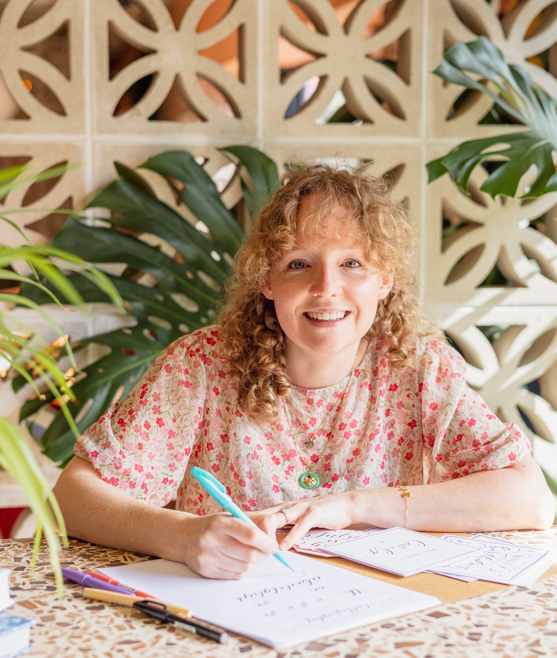
I'm your host, Laura Edrilyn, a London based calligrapher with a curious mind. Continuing this journey to connect with artists, historians, experts and letter lovers all around the world.
As the podcast grows, I'm so grateful that this season is once again kindly supported by Speedball art, champions of craftsmanship and creativity, helping keep the life of letters thriving across generations.
Today I'm talking to Chris Campe, a designer and writer based in Hamburg, Germany. Chris creates work at the intersection of text and image, art and design. She's published six books, teaches and speaks internationally and co founded the Berlin Letters Festival.
A huge welcome to the Life of letters, Chris.
[00:00:59] Speaker B: Thank you. And thank you for having me.
[00:01:02] Speaker A: It's great to have you on actually. And we were just talking about how snowy is there, how miserable it is here. So it's nice to be able to connect with you even though we're worlds apart sitting in our chilly studios. But firstly, can you tell us where your love of alphabets and letters has come from? Where did this sort of interest start?
[00:01:24] Speaker B: It has more than one source, actually.
I.
I studied illustration and at the end when I got the degree or during my studies, I.
I got really irritated with how people sometimes responded to my drawings because the people I drew looked a little bit like me.
They were women with short hair. So sometimes people would say, oh, that's a great drawing, but is that a boy or a girl?
And I always thought it's a line like I don't know what you see in it. But I got really annoyed with this, that even the figures, the characters I drew had to deal with gender in a way that I had to in the real world.
And then this whole question of gender representation in drawing and illustration led me to to get another degree, an MA in Visual and Critical Studies. And that's like two years of reading Walter Benjamin and Roland Barthes. And I did that in Chicago, so in English.
And at the end of that course I came to the conclusion that when I do illustration, Applied arts, I usually want to communicate something like a message or mood. And to communicate I have to use visual codes that people can recognize.
So there isn't really a way out of using stereotypes more or less. And that was part of why I decided to no longer draw characters and to focus on letters instead, because I thought that rids me of having to deal with how to draw men and women and queer people.
So that was One way in, but the other.
Another part of it was that I had always kind of been indecided between drawing and writing.
And when I graduated from high school, I thought about going into journalism or into illustration or design, and finally decided to do design because I thought as a journalist, I have to always go out there and talk with people. And I thought, that's really tiring.
After high school, I worked for two or three years for the local newspaper. So I had an idea of what that would be like and. And I decided to go to art school because that would allow me to just stay at home and draw quietly by myself.
Yeah. So. So part of it was like trying to get away from drawing figures. That led me to special specialization in lettering.
And another part was lettering, to me is the intersection of text and image. I treat letter forms as images because I have this background in drawing and illustration.
Yeah. So I have this narrative approach. And I really. I just. The thing I enjoy most is drawing with just a pen on paper.
And I still like. It still fascinates me that I don't need a lot more than that. Just a pen and paper. And there's just a blank page now, and in a second there's a drawing, and then I can take that and. And develop it further. And.
Yeah. It still amazes me that I need so little to create something new.
[00:04:55] Speaker A: Yeah. Wow. I love that and I love the journey that you. You went on to discover this idea that letters don't have to just be letters. I think.
I think that's a really lovely insight to have and be able to explore what else letters can be. They're not just symbols, but they can be illustrative forms on the paper. And it doesn't have to be typical illustration of animals and people and, I don't know, things that you might expect when you hear illustration to come from.
So you create a huge variety of letters. And I love your website. Everyone should go and check it out. It's like a little playground full of sort of joyful things all about Chris and letters. But on your website, you say that your medium is language and its visual form, and letters are your raw materials. So can you explain. I know you've sort of touched on this, but can you explain a bit more about how you use letters within your work?
[00:06:02] Speaker B: What I mean with letters are my raw material is that I really appreciate that when I draw letters, I never start with nothing. Like, it's never this completely empty page because the structure of the letters is already given and it hasn't changed. For like centuries and since Roman antiquity. The two diagonals with the horizontal in the middle are an A. So like the, the structure is the same and I can go from there and then I can create all, create all these variations of what the actual shape of the letter is.
But I also, especially in the last few years I've moved more and more towards doing my own projects where I also do the writing. I started out when I first, when I started my studio 2014. I did a lot of commission work for about 10 years and then gradually moved towards more of my own projects where I do the writing also or where I work on the content and the form in the same time or when they're self initiated projects. I think I figure out what I'm interested in and then I put together a text and then I give that text a shape.
For example, I did this project last year about creativity and for a conference that's like the creative that brings together all the players in the creative industries in Germany. So it's not just design but also music and the film industry and fine arts. And like I think there are 11 gaming, 11 different branches and they have a conference in Hamburg with 800 people. And it's just developed from all my, my work has developed from doing book covers and logos to doing. To creating photo opportunities for events like this where I knew some, some one of the organizers and she said we, we have this like 10 meter long wall, like do you want to do something with it?
Just around the subject of creativity. So it was great to have all the space and no further constraints.
So I asked people and my colleagues and followers on Instagram what are the things you get to hear again and again because you do creative work or because you are creative. And there was this one post that in the end had 250 comments because people just like freaked out and told me what they hear all the time. Like oh, you have so great.
I love your ideas. I wish I was as talented as you. I would paint too, if only I had the time.
Oh my kid could have done this better. And all these like prejudices and weird ideas around creativity. And I collected all these comments and then turned them into a kind of a long form poem that starts with oh, you're so creative. And then there are all these like comments arranged in a way that makes them like a poem. And it ends with oh, you're one of these creatives. That's so brave.
And then I painted and drew these commentaries on papers, on banners and posters and they were installed as a Kind of installation at the conference on this big wall. And that was a project I really enjoyed because I had so much liberty to work both on the text and the way it's delivered.
And it also was something that people looked at and they saw it, they read it, and they immediately pulled out their phones and started to take photos and selfies of their favor. Comments like the current one is, oh, AI is doing that now.
And there was a poster that said that so many people stood next to that poster and took a selfie because it's something that preoccupies them at the moment.
Yeah. So I really enjoy being at this intersection of content and form and writing and designing and noticing or like just noticing subjects of things that I. I'm that interest me and then try to elevate them to a level where other people can connect with it too. Or just like have the attention to notice what's going on with me and then have the trust to believe that that's probably something I'm not alone with and then give it shape in some kind and to create something that other people can connect with. And my ideal is always that people look at what I make and say, oh, yeah, I know that too. And I hope to put into words things others haven't quite put into words for themselves but are familiar with.
So if I can, if I achieve that, that's really the best for me.
[00:11:49] Speaker A: Yeah, yeah. So really a communication tool as well as an art form, as well as sharing your own kind of feelings, but hoping they resonate with other people, I think is incredible because, yeah, as you say, this sort of intersection of tools and materials and forms and.
And what goes out into the world as well. Right. And how you put it out there into the world. So you have options of doing kind of murals, kind of larger walls, and I know you do kind of windows and big scale things, but you also work on paper quite a lot. Is that right?
[00:12:29] Speaker B: And.
[00:12:30] Speaker A: But then there's a digital side as well. Do you kind of use them both wherever you feel works best?
[00:12:40] Speaker B: I know I decided maybe 10 years ago that early on, after I graduated from art school, I decided that I didn't want to work on the computer the whole time.
More and more, I just feel that working analog has so many advantages now, especially AI can't paint a protest sign or fill a sketchbook and turn that into a book. And so now there are advantages to working analog. But also two or three years ago, I got contacted by the curator of the Museum of Arts and Crafts in Hamburg and I just got this email saying, oh, you're one of the key players in lettering design in Hamburg or in Germany. I would like to collect your work. And I was really happy that my work didn't only exist on my iPad, but an actual folders in the basement of my studio.
And it was funny because I had just spent a few months organizing my archive and putting everything in order and creating this big spreadsheet with where is everything? And so she came by my studio and took a big, like many of my many projects I had done 10 years ago to the collection of the museum.
And I like to tell that story now in my workshops also because, yeah, it's good to work on paper because the museums don't collect digital files, at least not yet. I'm sure they will have to find a way to do that. But at the moment they collect paper. So I was happy to have paper. And also I just like things that exist in the world on paper. And I also like the resistance of the paper and that I have to deal with mistakes in a very different way than I do when I draw on my iPad. I also draw on my iPad and I use it a lot. I use it for color usually when I work analog, I don't bother with color, but I actually bought an iPad to be able to work with color more easily. And so I use it, but it's not very central. And I also use it to create animations. I did like a whole set of animated lettering gifs that I uploaded to giphy. And I started doing that because I was interested in animation and adding this additional dimension to the letterforms of making them move. And I guess that was at a point when I was starting to get a little bit bored. Just drawing letter forms and having movement adds like a whole new dimension to that. So I. And also I do. I'm very. I have been very active on Instagram since I started my studio, and it's been one way of attracting clients. So I take it quite seriously.
And I never found gifts that I liked with lettering. I always thought they were too cute or just not my style. And that's why I started to draw my own. And over time, I don't know how many there are now, but probably 50 different ones. And they're all white lettering gifts. And I guess I have this specialization now in white lettering gifts. But that was also I needed just born because I needed them. And then I started creating them and I created more and more and more, and now they are on giphy and everyone can use Them.
So I'm probably more of an analog person, but I also use digital tools and it just depends on what the purpose is. And usually when I work for clients, in the end it's always digital because it will be printed or somehow distributed.
Yeah, so it's.
I was going to say I don't prefer one or the other, but I think I do prefer analog just because I like things that float around and pieces of paper that I can cut up. And.
Yeah, it's just so different than the digital. And also I like that I can't undo as quickly as I do on the iPad.
Often when I draw on the iPad, I do one line and then I think, oh, that wasn't it, and I undo it and redo it and I do that 50 times. So I get stuck in parts. Like, I get stuck on details that really don't matter. And when you zoom in to 1,000% and, like, work on individual pixels, it's just useless.
So I appreciate that when I draw on paper, I can. I can put the paper to my eyes, but I can't zoom in like, like, like I can on the iPad. And it's. It's usually helpful not to be able to get hung up on details.
[00:18:11] Speaker A: Yeah. And that sort of perfection, sort of stilting you slightly, especially if you're in a bit of an artistic flow. And I guess that's the beauty of working on paper, isn't it? It that tangible, physical feeling of it. Pen to paper. Like everything that's flowing physically from your mind through to your hand, through to the pen or brush or.
And onto the paper. But, yeah, I think that's a lovely way to see it because I think a lot of people get frustrated with that. But actually stepping away from it and seeing that as part of the process is really a really great way to see it.
I wanted to touch on the protest signs as well, very briefly, because as you were talking, I was wondering, do. When you're doing any protest signs and working with those sorts of words and letters, are you being asked to create these, or are you just creating these for. From your own kind of thoughts and feelings or a bit of both?
[00:19:19] Speaker B: Do you mean am I being commissioned to do this or are political groups asking me to create portrait signs or something like that? Yeah, no, and maybe I have to give a little bit of context.
So I've become a protest sign influencer. To my big surprise, in the last two years, I didn't know that was possible.
Two years ago, a group of journalists revealed that the fascist party In Germany, the RFD met with other extreme right groups in Potsdam, near Berlin, and they planned to depart like 20 million people from Germany, basically just based on hair color and skin color.
And after that, when this piece of journalism got released, there were huge protests in Germany. Like hundreds of thousands people went to this streets to protest that. And I also went, and I went with a protest sign. I painted a protest sign. And I've, I've always, like, there is a photo of me when I was 12 or 13, maybe 13, going to a demonstration in my hometown, small town in northern Germany, protesting against discrimination against foreigners, as it was called then. And that was in the early 90s, just after, after Germany got united with East Germany. And there was a big surge of anti racism in Germany back then also.
And so I've always gone to these protests. I just never made that part of my professional appearance on Instagram.
And I also felt that I'm a professional designer. I shouldn't be too political.
I shouldn't.
If I give the impression I'm like a radical leftist activist, then nobody will hire me anymore. And so like, I tried to keep a low profile on Instagram especially.
And at the same time I thought, I have all these followers, like 27,000 now, and I should use that. I have this platform, I should speak, I should say something. And I wasn't really sure what I could say because it always felt like anything I could think of was either really banal or just too radical, I thought. And then when the big protests happened two years ago, I just painted a sign and went there because I would have gone anyway. And when I painted the sign, I thought, oh, this is lettering and I have this lettering account. I'm just going to show it.
And then that was the one story that got the most likes and everything, like the most resonance ever.
And after that, I painted many, many, many more signs. And pretty quickly people started to copy my signs. And some made like pretty exact replicas. Some just took the text and made their own stylistic variations. Some adapte style and the style is quite recognizable because it's white lettering on a black background, which has to do with my white GIFs. When I was drawing the little animated GIFs, I realized that white lettering sticks out best on the backdrop of a photo, which is usually darker. So my project signs were also white lettering on a black background. And I cut out the contour. So it's, it's a bit of a distinct style. And when people copy it, I could, it's. I can easily tell that they must have seen my work. And in 2024 and 2025, many people did. And sometimes there were reports on the demonstrations with photos of 50,000 people in the streets. And I could zoom in and be like, oh, there's my sign, and there's my sign. And somebody made it a variation of my sign. And so that was cool.
Yeah.
Yes. And also totally surprising and not anything I could have planned for at all.
And I think many of the best things I did were things I just did because I felt like them or I thought they were important. And then. And this, the protest signs in particular, just somehow spoke to a lot of people and also activated people into painting their own protests.
And I think. I mean, people who follow me on Instagram, I think they follow me because they're interested in lettering and design, not necessarily because they are political people.
So there are many people who do lettering as a hobby, and some of them, I think, made the connection for the first time that they can use their creative skills to participate in democracy.
And. And that's really great. I mean, that's, I think, the biggest achievement my work could have, like, to activate people into going to a protest or joining a neighborhood group.
And.
Yeah, and also, looking back before this all happened, I had thought, oh, I shouldn't be too outspoken. It'll scare off people. But. And actually the opposite happened. The moment I started to speak out, I was more.
Just said what I think, which is like, we already had fascism.
Don't make this happen again.
The moment I started to say what I think, people could connect with me, or it was much easier to connect with people. And many things happened because of that. And also I got invited to the workshops, and I. I got commissions because of the protest signs. So it wasn't hurting my business at all. On the contrary.
And that was a very, very interesting thing to. To realize.
[00:25:51] Speaker A: Yeah, incredible. And, you know, great that you just did it. It's very easy to get into your head why you shouldn't do something, and what if people don't then want to work with me? And I think that's a really important thing to bring up, that actually you did do it, and it had the opposite to what you were expecting. It actually connected you deeper with. With those who follow you, your audience, the people who maybe buy from you, commission you, but also are inspired by you and your ripple effect that then gets sent out. So, yeah, I think that's.
That's a brilliant aspect of your work.
If you're enjoying this episode and fancy supporting the podcast, you can literally Buy us a coffee. Head to the link in the show notes. It's a lovely way to help keep the life of letters going. Thank you. Now, let's get back to the episode.
I mentioned at the start that you have written six books about alphabets, which is incredible because I think I could probably do one half a half a book.
And I wondered if you could talk us through the books and how they came about.
[00:27:12] Speaker B: So after high school, before I studied illustration, I did an apprenticeship in a bookshop.
So it's two and a half years training on the job in a bookshop, working full time and going to professional school in parallel.
And it was a bit accidental that I did it.
I kind of wanted to stay at home a little bit longer with my grandparents because I thought they wouldn't be living so much longer or something. So I stumbled into it and I think the first job, like, really sets a focus somehow. Like often the first job people learn or the first profession people learn, like plays a role later on. And so I, from the beginning of, of working, I was going to say my career, but I don't. I don't know if that's part of my career, but that was the first working experience I had working in a bookshop and being trained in this industry.
And I've always read a lot.
And then I had this professional training and I knew a lot about publishers. And even when I was 19 in the bookshop, I thought, oh, one day I want to have my own book, a book with my own name on it. And it took 10 years to make it happen.
But I think having been professionally trained as a bookseller seller really set this focus on books and also gave me the knowledge of which publisher does what and how are they working. And I had a few, like, I knew a few people who worked for publishers that I could ask how to.
How to go about it.
And that helped in the beginning.
But it's. I think it's just a love for books initially that took the form of reading a lot and then working in bookshop. And now, then I wrote all these books and even now working in my sketchbooks, it's still the book format of like having a linear.
An object where you flip through linear, like you put things in order. There's this page and then there's that page and then this. So it's just a focus.
And the first book I did is called Hamburg Alphabet.
I'll just get it. I have it here.
It's maybe too much to talk about all my books, but I'm Just going to say something about three.
So Hamburg Alphabet is a book about shop science in Hamburg and 220 remarkable shop signs in alphabetical order.
This came out in 2010 and to create the book I went around Hamburg on my bike for like six months and took photos of a thousand different signs and then I put them in alphabetical order into this book. It's a bit larger than a postcard, so it's a small book, but it has my name on it.
Gold achievement.
Yeah. And.
And then after, after 10 years I wondered what happened to all these signs? Are they still in place? Like, I want to go back and see what happened. So I went back and created an updated version of the book. It's a bit confusing because the updated version has the same cover.
The. The neon sign on the COVID of the book hadn't changed, so the COVID looks identical. But when I opened the first page, you see what happened. It's all blank walls because so many signs had gone.
I created another spreadsheet and put in all the signs and it turned out more than 40% had gone between 2010 and 2020.
So the first book is inspiring collection of shop signs in Hamburg and it's eye candy and nice to look at, but the two books together really tell something about. About city history and how the surface of the city changed within 10 years.
Yeah, and I think that's really interesting too, so.
[00:31:49] Speaker A: Really interesting.
[00:31:50] Speaker B: Yes. So now it's like 2026. In four years I will have to go back and take photos of all the shop sites again.
[00:31:58] Speaker A: We need a volume three.
[00:31:59] Speaker B: Yeah, yeah, there will be a volume three. And the first volume it had an index with the addresses of the signs, but I put the street, but I didn't put the house number. And when I wanted to go back to take the photos again, sometimes I couldn't find the. Like I had no idea there are some streets that are like kilometers long and I just couldn't find where was it because sometimes the building had been torn down and.
And what helped me was Google Street View because when I did the second book in 2019 and 2020, Google Street View still had the photos from 2008 to 2010. So on Google Street View the work was still intact and I could go back and write down the streets and find the shop signs I couldn't find. So that's the only change I made in the updated version. The index now has the house numbers, so the third edition will be a lot easier.
[00:33:06] Speaker A: Yeah, that's going to help you. But also lots of other people if they want to go and visit these places.
[00:33:10] Speaker B: That's great.
[00:33:11] Speaker A: Yeah.
[00:33:11] Speaker B: And then I. The second book was a travel guide to Hamburg I'm not going to talk much about.
Came out in 2013 and it's like 200 of my favorite places and shops in Hamburg. And then in 2617, my first lettering book came out. It's called Handbook Hand Lettering. So Handbook Hand Lettering.
And it's the foundations of. Of lettering and everything I knew about lettering at this, at that point.
And it has a lot of text, which is why it has never been translated to English because the translation would have been so expensive.
And there are already enough lettering books in English.
I did a book about brush lettering after that hand lettering book. So it's like specializing in. On brush lettering for 220 pages and then.
But the one book that is in English. So I wrote three books about lettering and type design in three years between 2016 and 2019 and a total of 600 pages. And then I was like completely empty out.
[00:34:28] Speaker A: Yeah.
[00:34:29] Speaker B: The. The third book in this row is called Making Fonts and this actually has an English version, actually an English version and an American version and of the same title. It's called Making Fonts and it's an introduction to type design for graphic designers and illustrators who dream of one day making their own font. And I wrote this with my friend and colleague, Ulrike Rausch. She's a type designer in Berlin and she specializes in fonts that look handwritten.
And I, since I met her, I thought, oh, I want to know, like, how you do it. So the way this book came about was I thought she could tell me how she works, I could write it down and then we turn it into a book. And that's basically what we did.
And it worked really well because I was at the same time author and target group.
I could. If I didn't get what she was talking about, then nobody else would. So it was a good filter.
Yeah. And yeah. So this book is still available and it's actually, I think the English language editions have had a wider reach than the German ones and was really fun to. It might have been my first big collaboration. We worked on this for a year and it really was something I couldn't have done on my own.
And that was a good experience. I used to think, oh, teamwork is so annoying.
In the end I do all the work and the others, I don't know in this arrogance in part. And also I think at school teamwork was just frustrating. But now, working with someone who is equally qualified but in a different field was very rewarding.
Yeah. So that was the type design book, which only made me realize that I'm not interested in type design. So I wrote a book about type design, but I've never published a font because it made me realize I enjoy drawing letters, but I don't enjoy the technique, like the fun production part. And I haven't, I haven't asked other people to do it for me yet. So I have all these fonts I started, but I haven't published any, any font. And of course people always ask me this, do you also do fonts?
And I don't. And I kind of want to keep it like that.
I kind of think I'll just never publish a font and that'll be my thing.
[00:37:06] Speaker A: Yeah, I love that.
[00:37:08] Speaker B: I love that.
[00:37:09] Speaker A: Stick to, you know, your guns on this. It's, you know, there's a reason you do what you do and it doesn't have to fit with other people's expectations or wants or assumptions of what you should do. But that's amazing. And now you've got a brand new one.
[00:37:29] Speaker B: Yeah, I have. So I'm going to show these two together. So it does offer that. And there's the one I just unpacked. More alphabets.
And so these belong together.
There are a collection of 100 alphabets each from my sketchbooks
[00:37:51] Speaker A: and stunning.
And it's all black and white. So we've got, as you mentioned earlier, obviously enjoying, enjoy using black on white. But there's also lots of standout paint pages where it's black background with white letters. There are some complete alphabets and there's some individual stunning letters on their own. And they all have completely different styles, forms.
Yeah, stunning, sort of blockier ones, elongated ones, which I've seen you doing on Instagram as well. And then, yeah, individual letters.
And were those mostly from your sketchbooks? Are there some that you would have kind of played around with on an iPad and created digitally as well? Yeah, so mixtures.
[00:38:42] Speaker B: Yeah, most of them are just double pages from my sketchbooks. And the first, the alphabets book, the first volume was got started because I participated in a hundred day challenge by Francis Chouquet on French colleague 100 days of lettering. He's also like active on Instagram and sometimes he does these challenges and once I joined him and so I created lettering every day for 100 days in a row. And I did that in my sketchbooks and often I would draw alphabets just because that way I don't have to worry about what to write. And I don't like inspirational quotes, quotes because they're just so boring and trite.
So drawing alphabets is a way of drawing letters without having to deal with the message and just being able to play with the forms. And so for the challenge, I drew a lot of alphabets, and then I put them all together in a book.
And since this was first published in 2020, the first volume, and since then, I just kept drawing more alphabets. So the more.
The More Alphabet Book. The second volume called More Alphabet, is just an update. And in here, there are.
This is, for example, a sketch for one of the window alphabets, the series of alphabets I painted on my storefront window.
That's another thing I guess we can talk about. So these are sometimes sketches for other projects, but a lot are also just formal experiments in my sketchbooks. And in the. In the Moore Alphabet book or the second volume that just came out, there are also a few fonts. A few of the fonts that I drew and. But I didn't publish because I didn't finish them in here too. Yeah.
[00:40:52] Speaker A: And do you hope that people will pick these up and have a go at creating their own, recreate yours, like, use it as inspiration in their own work or just a kind of nice coffee table. Must have kind of book? What. Where.
Where do you see? I mean, there could be all of those things.
[00:41:13] Speaker B: That's a great question. I think. I think. I hope it inspires people to draw their own. It might just inspire them to copy mine, which is fine, I guess, as long as they don't say they made the work. But I think I like to show the whole range. Or to me, it's like. It's so fascinating that, like I mentioned at the beginning, there's this structure that. That stays in place, but then the shape can vary, and I can draw the letters really long or blow them up or use different tools. And what's interesting about alphabets is the tension between having this really familiar structure that everyone knows, even people who don't know how to write or read know letters or, like, know the Alphabet, like, recognize this is an Alphabet. And so the structure is very, very familiar. But the shape or, like, the. The way it's drawn can be, like, really crazy or novel and unseen.
And I really enjoy that tension.
There's something really familiar, but then the way it's shaped is quite unusual.
[00:42:29] Speaker A: Yeah, yeah, yeah. I love that. Do you have a favorite Alphabet or script or. That's a horrible question. That exists in the world already. So something that you maybe haven't created yourself. But when I see your, your books and your work there, I, I feel like some of them have this kind of, maybe not Sanskrit, but something. There's sort of ancientness coming through some of the styles and I just wondered whether there are particular kind of scripts or maybe even alphabets that, that are no longer in use that you get inspiration from.
[00:43:07] Speaker B: I don't really have a favorite font like a current one because I think with fonts it always depends on what you're going to use them for.
I mean, I like Futura, but the like for Futura is just.
I like Roman capitals, like which Futura is based on. So the shapes of the roman inscriptions from 2,000 years ago.
That's also my starting point for the online course I teach because that's really just the basic structure that hasn't changed for 2,000 years. And it's a great jumping off point to get creative, but it's also great to have this foundation to keep the link to these proportions and letterforms and then go from there and also fall back on that rather than being out in the open and doing whatever. So maybe what seems ancient to you is this link to Roman capitals that many of my alphabets have just because they share or they have some reference to the proportions of Roman inscriptions. And I find it really helpful to have both structure and freedom and not just one or the other.
[00:44:43] Speaker A: Yeah, I love that. I think this is probably the biggest sort of reoccurring theme in a lot of my conversations, particularly with artists who create letters have, have particular styles. It is that structure and freedom that you get with letters, which is a beautiful world to play in.
And I'm glad you mentioned the online course because you teach it with this guidance in place, with this idea that you're using that structure and creating something new out of it. And I guess is that your system for adapting letter forms and how you would teach that to others?
[00:45:29] Speaker B: So it's a, it's a six week online course and I'll teach it for, in English for the first time in March. So I'm at the moment I'm like going through what I've taught a few times in German in the last two or three years and I, it's so hard to.
Because it's only six weeks and, and on any of the things I address you could easily spend half a year or year and it's so difficult to pick out the few elements that I think will really help people to get started.
Or to find a few elements that are something that people can go from and really develop into their own practice.
And. And Roman capsules. And understanding calligraphic tools, like knowing the difference between, like a round nib, a broad nib, and a pointed pen is, like, so essential.
But to teach that in just one session is impossible. So I try to give people entry points to things they can go into deeper if they find that that's something they get interested in.
Yeah. So at the moment, I reevaluate what are the six lessons that people really need to develop their own approach to letters. Rather than, like, I don't want to just teach one calligraphy style or one drawing technique for letters, but ideally I would like to show different entry points or different perspectives on looking at letters and working with letters that allow people to find their own focus within that, and then they still have to do a few years of work.
I think in the beginning you need to find this one thing that really interests you, interests you, that will keep you going during that time when you have to actually sit down and do daily practice either of calligraphy or of drawing or like it. It will always require a lot of practice and practical experience for people to really get good at lettering. So all I can do, I think, in. In the class is set a starting point and show them different routes and.
And then it's up to the people to go from there.
[00:48:14] Speaker A: I think that's. That's great to be able to offer a course, as you say, that covers a lot of different elements, but allows people to continue their practice as they need to.
[00:48:23] Speaker B: I met one participant again after a year at the book fair in Frankfurt. And she, she actually, after half the course, she said, okay, I found my thing and I'm good. Like, I'm not going to come back because I really found a thing I love. And she just, just in the beginning, we did a bit of calligraphy, basically just to explain the writing tools. And I asked people to write their own text, just like, stream of consciousness, fill pages. And she started doing that, and she really loved, like, just writing texts with a speedball nib. And she's still doing it, and I love that.
So for her, the thing wasn't, I want to be a lettering artist, but I want to write my mind in calligraphy. It was so specific, and it was great that she found the freedom to do that. And I know other participants, some, after the course do daily projects or some focus on creating lettering styles for their graphic recording work.
And some just, just really have a better Eye for working with typography without ever drawing letters again. So there's so many.
I think drawing letters and knowing more about also the history of lettering and different calligraphy styles and how they relate to letter forms is beneficial or can be beneficial in so many ways. And then it's up to the people to find their own focus.
[00:50:02] Speaker A: Yeah, brilliant. It's a playground to enjoy and not prescribe. Right. So people will find their own, their own way with these things.
Sort of wrapping things up.
Last series I asked every guest quite a challenging question, but it was so insightful, I sort of thought, let's do this again and just see what comes up.
What is your favourite letter of the Alphabet and why, if you have one?
[00:50:33] Speaker B: I don't think I have a favorite letter, but some letters are just more interesting to draw than others.
Obviously the I, the uppercase I just doesn't offer a lot of material because it's just a straight line. The lowercase I at least has the dot that I tend to draw really large. Or you can give different shapes and the R and the K are fun to draw and the M and yeah, I think I would go by which letters offer the most interesting forms to draw or offer the most possibilities for variation. And I think K and R because especially R because it has a vertical and a round shape and a diagonal.
That's. That's a lot to. To play with.
[00:51:28] Speaker A: Yeah, yeah. I always find ours, especially in the calligraphy that I teach and do have a kind of marmite appeal to them. There's lots of different ones that people are like, yes, I love this one. Oh, I hate that one.
[00:51:43] Speaker B: Oh, I like this one.
[00:51:44] Speaker A: Oh, I don't like that one.
So, yeah, variations are always really welcome for certain letters so that people can find the one that they love or maybe perfect the one that they struggle with. But thank you so much. I think that's been hugely insightful but also wonderful to get to know the work that you do in, in all ways.
To find out more about Chris, you can visit allthingsletters.com or Instagram where she's @allthings letters as well. But as always, we will put it and the links all the details in today's show notes. I just want to say a huge thank you to you, Chris. Thank you so much for joining me today and being part of the life of letters.
[00:52:31] Speaker B: Thank you, Laura.
[00:52:32] Speaker A: Thanks, Chris.
Thanks for listening. Series 5 is made possible by my wonderful producer, Heidi Cullip and the support of Speedball Art, whose commitment to high quality tools and creative tradition continues to serve, partner and deliver to artists all over the world.
If you enjoyed the episode, don't forget to subscribe and leave a review or share it with a fellow letter lover. And until next time, keep listening, keep creating, and keep celebrating the life of letters.