Episode Transcript
[00:00:01] Speaker A: Welcome to series six of the Life of Letters, a podcast exploring the art history and future of calligraphy, handwriting, signwriting and all things letter related.
I'm your host, Laura Edrilyn, a London based calligrapher with a curious mind.
Six seasons in, I'm still fascinated by the stories hidden within the letters and the people who dedicate their lives to preserving, studying and creating them.
This season, we're exploring letters through the lens of books, a library of letters, if you will.
As we begin another season of conversations and discoveries, I'm delighted that the Life of Letters is once again kindly sponsored by Speedball art, champions of craftsmanship and creativity, helping keep the life of letters thriving across generations.
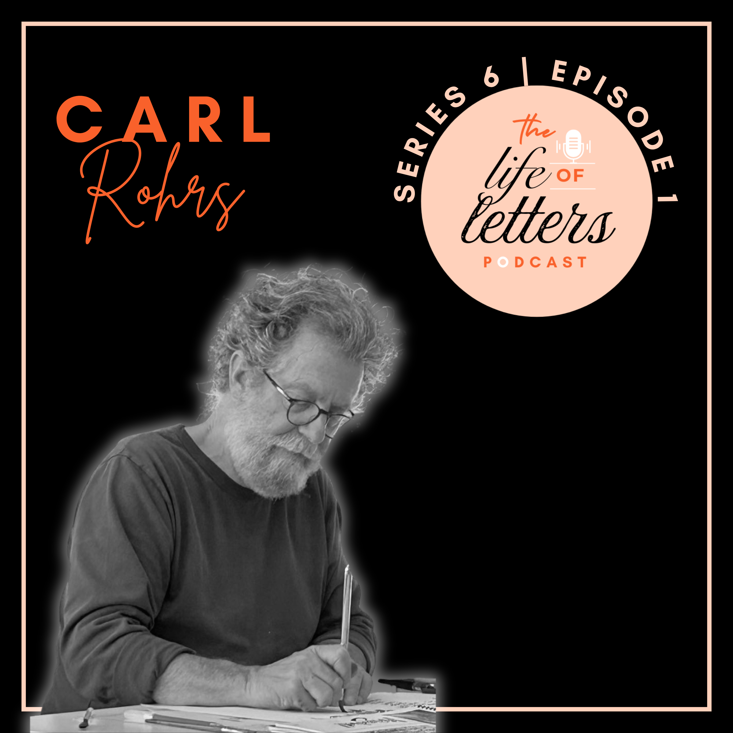
In today's episode, I'll be speaking with Carl Rohrs, the editor of the 26th edition of the Speedball textbook. Welcome to the Life of Letters. Carl, can you give us a brief introduction to who you are and what you do?
[00:01:07] Speaker B: Hi, Laura, thanks so much for having us.
Having a speedball and me, I.
I've been a lettering artist for more than 50 years now. I was a sign painter for Independent Sign Painter for a long time. I taught lettering and typography at Cabrillo College since 1984, and I've taught workshops all around the country and actually lucky enough to teach all around the world since the mid-80s also. And I've been the editor of Alphabet, the journal of the Friends of Calligraphy, which is San Francisco's calligraphy Guild, for 11 years now. And.
And now I am lucky enough to be doing the Speedball books. It's like a dream come true.
[00:01:51] Speaker A: Yeah. What a journey. And I love that you're sort of blending the artistic side with the editing side. Now. I wondered if you could give us an idea about what sparked your interest in letters and calligraphy. Like, where did this all begin for you?
[00:02:07] Speaker B: You know, it's almost unrememberable.
Is that the word? I don't remember when I first became interested. I just feel like I've always been interested in lettering. When I was a little kid, all the cartoons I drew, they all had titles. You know, I would do the lettering, just block letters on that. I did the, the posters in school for elections and events and stuff. I was always doing lettering then.
A huge moment for me was psychedelic lettering.
I was a teenager when all that started happening, the psychedelic posters and album covers and stuff. So that was a gigantic moment for me. And when I went away to college, there was a calligraphy class. I'd never heard the word before, but as I Heard that it was lettering, I signed up for it and just took to it immediately. And speedball textbooks have always been a part of my lettering history. And I don't even remember the first time I saw one, but they've always been there. So to end up with this job, it's, it's amazing.
Hard to believe.
[00:03:05] Speaker A: That's so great. I know. And sometimes these things, right, they're, they're just part of your journey and you don't know where the thread started.
[00:03:12] Speaker B: Exactly.
[00:03:14] Speaker A: Can you tell us a little bit about the history of the speedboard textbook? Let's get into this and also maybe introduce what the speedball textbook is for those who don't know. Okay.
[00:03:25] Speaker B: Happy to 1915, the first speedball book came out and it was designed by the two men who invented the speedball pen. And the speedball pen was specifically designed to do movie titles, the lettering and the speech, what do they call them? Screens for silent movies and traditional calligraphy pens made too fine of a hairline for the camera to pick up. So they designed the speedball pen to be bold.
So once they invented the pen, they put out these little booklets to show the kind of letter styles that they had invented for their new pens. And that began this 115 year, 110 year journey we've been on all this time.
The two men were William Hugh Gordon, who was a mentor to his younger partner, Ross F. George. William Hugh Gordon became deathly ill in 1919 and sold his half of the company to Ross F. George. And then he died in 1920. And Ross George then single handedly put out each subsequent edition of the Speedball textbook for 40 years.
So from 1920 to 1956, I believe 1957 was the last one that he edited himself. And that's how many editions was 12 editions over those 40 years. And after that, the company, the Speedball company, took over and they were sort of edited by committee for a while. And finally in 1992, 1991, I'm sorry, Judy Kastan and Joanne Fink took it over and that's when it really became aimed right at calligraphers because Ross F. George had aimed it at professional sign people who were doing show cards and ticket writing and stuff like that as well as calligraphy. And it slowly evolved into having more and more calligraphy towards the end of Ross George's time as editor and once he died, much more. But it was the 22nd and 23rd edition by Joanne and Judy that really turned it towards, specifically towards calligraphy.
[00:05:34] Speaker A: Wow.
And can I ask, I can't do the maths. How many. When does an edition, a new edition, need to come out? Or is it just sort of as and when?
[00:05:44] Speaker B: It's sporadic. Okay, George, you could see. And by the way, the place to find out the history of the Speedball Textbooks is the 24th edition by Angie Vangelis and Randy Hassan. Because it was the hundredth year anniversary, they really dedicated. There's a whole timeline that has all this information. That's where I'm getting the specific dates. But George would do it every three years, four years. There was a seven year break for World War II, and so generally in the five year time period, and since the 24th, 24th, 25th, and now the 26th, they have been five years apart. So it seems like Speedball is committing to this idea of a five year time span between editions.
[00:06:24] Speaker A: Right. Okay. And I guess it's interesting because my mind is going, what happens in the world of calligraphy in five years, you know, is a lot. Is it a lot? Is there new stuff to tell?
[00:06:36] Speaker B: Well, not so much to tell, but there is new stuff to show for each of these topics. That is, you know, letter styles that have traditionally been in the book, as well as traditionally being taught as classic calligraphy classifications or hands or styles. So we address those. And I am a huge one for wanting to see new stuff. So I felt like the 25th edition, which I was involved with, and then the 26th, I wanted them to be complementary, but I wanted as much new stuff as possible while we're still talking about those same letter styles. So there is such a. You know, there's always been wonderful letter artists the world over, but with the Internet, I know about, we all know about so many more of them, and there is lots of work. You might be able to put a book out like this every five months if it wasn't so much work, because so many people are doing so many exciting things with lettering these days.
[00:07:34] Speaker A: That's amazing. And what, what a hopeful kind of exciting thing to be a part of. And I guess when you started the 25th edition, so you, you did that together with someone else. You're. You've got an editing background, Right? Tell us more about how that all came together.
[00:07:51] Speaker B: Well, I, I have been doing this journal for the Friends of calligraphy since 2015, although I did three years of that in the early 90s. And so I had always, I had done that before, but now this last time I started it and something just clicked. The research, the writing, the finding sources of, you Know, sources of stories, lettering artists and history. All of it just, I was just ready for it now in my, my old age here.
So I've just been fascinated with that.
Randy Hassan, who was one of the 24th edition's editors, commended me to Speedball to Kelly Braun. And it was based on what I'd been doing with the magazine that I got the gig, I think.
[00:08:43] Speaker A: Amazing, Amazing.
[00:08:45] Speaker B: Can I just give a shout out to my co editors of the 25th edition? It was Suzanne Cunningham and Sachin Shah and they were both wonderful to work with, but they weren't the designers. And because I was doing the design, I hope they didn't feel like it was a power grab, but I just kind of took over because I was laying out the pages and you know, it was, it was so much fun to lay out those pages. Those early meetings were so exciting to see what we were doing with, with the pages.
It's a fun thing. It's a really fun thing. I love doing the magazine, I love doing the book.
[00:09:15] Speaker A: Amazing. And I'm sure they were grateful to have someone take the lead for it, especially if they know that you're enjoying it. I think that's, yeah, that's a special talent to be able to take that on and design and see, I guess it's quite a visionary process that you can kind of see what the pages need to be laid out as. Is that like, is there a process in your mind of how you edit these things or does it become second nature?
[00:09:39] Speaker B: Well, it was definitely, you know, we were looking at the editions that came before, you know, the letter styles that had happened. And so I just knew we had to hit all these different letter styles. And Suzanne Cunningham is a pointed pen, calligrapher, copper plate type of calligrapher. So she was editing that section and gathering the artists for that. And Sachin is really active online and knows the younger calligraphers, so he was bringing those guys in. So there were a lot of categories already established that we had to fill. And then it was just finding the best of contemporary lettering artists to get work from for those kinds of, for each one of those styles, those departments of the book.
And the other thing that's the tradition of the speedball textbook is that George would repeat plates from addition to edition. He'd do a classic plate and then they would, he would put that in with new stuff every edition, but things were repeated. So we did have that to fall back on that we could use earlier work if we wanted. But I just always thought if we're going to print this. Let's find something new. Let's find the. The greatest that's happening now or. Or old classics that people may not have seen. That's also really important to me. I love the history of. And especially great work that should have been seen from the 50s or the 60s or the 80s, whenever, if it was low on the radar, I love to bring that in as well as have fresh new.
[00:11:14] Speaker A: Yeah, amazing. And this might. You might have already answered this in that answer, but what was your kind of hope and mission for this new edition that kind of would set it apart? Was it just having new things and bringing that excitement through, or was there a sort of underlying. I want to meet the readers in a different way here?
[00:11:34] Speaker B: Both of those things. Definitely both of those things. Laura, that's a great question. Primarily it was to fulfill those letter styles that we had to represent were. With fresh work. And there were definitely plates that are repeated, but I would redesign them completely so that I wanted every page to look different, even if we were repeating something from the previous edition. I wanted to do some surprises for things that hadn't been represented before. I don't know if you're. Well, your readers may not know that or your listeners, I should say viewers may not have. May not know that. There were four types of speedball pens.
Square nib that, you know, they call it a bent nib. So there's a square that sits on the. On the page and makes a monoline with a square and there's a round. Then there was a C. The flat tool, like a normal calligraphic pen, is the C, and the D was an oval. So I'd never used.
I'd never been that interested in those monoline tools as I've been growing up. I always like calligraphy type stuff, but I started to uncover great stuff about the bee. So the bee section is really expanded this time. And I was able to do a plate of my first art hero, Rick Griffin, who was a surf cartoonist and a psychedelic poster artist. And he used a speedball pen throughout his career. And he used it also as the representative of his alter ego. In some of his cartoons, he would show an ink bottle holding a speedball pen as a lance, as a sword, you know, so the speedball pen was always his representation of the artwork that he did. And nobody's made this connection. He's a legendary artist in especially psychedelic posters and the surfing world. And nobody had put this together. So there's a whole spread devoted to my boyhood hero, Rick Griffin. Because he used the Speedball pen. His relationship with the b nib of the speedball Penn.
So it's stuff like that.
One of the first calligraphers that was represented in the Speedball textbooks towards the end of Ross George's life was Ray Dubal, a very famous commercial calligrapher from Chicago. And he was in the 18th and 19th and 20th edition and hadn't been since. Since the 20th. And so I was able to put a page of Ray Dubal's work in because he's a warm, warm calligraphy. You could just see by looking at his letters. So there are all these little things that were close to my heart that with the freedom that Speedball gave me to edit the book, that I was able to, you know, do this subterfuge of my heroes growing up as a lettering artist.
[00:14:19] Speaker A: Amazing. Yeah. And it's like a homage to those that have inspired you, I guess, even if it wasn't in the immediate kind of, oh, I'm inspired by this particular artist. But even growing up, there was letters coming into your world through other. Through other moons.
[00:14:36] Speaker B: Yes.
[00:14:37] Speaker A: All right, two questions. One, when you say plates, is that how you lay it out? Is that what gets printed on?
[00:14:46] Speaker B: Well, plates was just another thing to say.
A design, a page of alphabets, a page of an Alphabet, or a letter style.
It's just, I guess it's an old fashioned term for a layout page, a plate.
[00:15:02] Speaker A: Okay, I just thought I'd check. And then also, have you got any kind of standout artists or styles?
[00:15:10] Speaker B: Well, my old friend John Stevens is a calligrapher from New York. He lives in North Carolina. He's lived in North Carolina for quite a while, and he's generally considered pretty much the best there is. And so I featured John on lots of plates in both the 25th and here in the 26th. But I have so many lettering heroes that I'm lucky enough are my friends that I could talk for a long time.
[00:15:37] Speaker A: If you've been enjoying the life of letters, I'd love it if you'd hit subscribe wherever you're listening today. It's a simple way to support the podcast and make sure you never miss a new episode. And if you know a fellow letter lover, why not share it with them too?
Now, let's get back to the episode.
[00:15:57] Speaker B: There was a wonderful woman artist here from San Francisco named Georgia Deaver who passed away in 2013, and she was had the lightest touch in the world with any tool. She had a brush or a quill or Pen.
And just a delightful, unique, original artist. And I featured her quite a bit in the 25th, as well as returning to her in the 26th. Boy, I could just go on and on. Who else? If I open up the index here from the last one. You know, there's so many heroes from the past. Howard Glasser was a crazy old guy from.
Who was born in New York, but he made his career in Massachusetts. And we featured him in the 25th quite a bit. Oh, Michael Clark. Michael Clark was a Virginia commercial calligrapher. He was my age, my contemporary. I knew him for decades. And he was always a speedball advocate and an originator. That he was the first guy to take the round nib, the B, round nib, and make thick strokes with the round nib. And then he'd turn it on the side and use its edge for the upstrokes on the thin side. And then he'd turn it back around and do the thick stroke with this. So he made his completely original style from the speedball nib. And he was also, I think he did some sort of traveling advocacy for speedball in the right at the turn of the century. And he has always advocated their stuff. So he was highly featured in the 25th when he was still alive. And then he's passed away since the 25th. And I featured him a lot in the 26th. In fact, I dedicated to the book. Dedicated the book to six different lettering artists who had been in previous editions and had died since the 21st. And the book is dedicated to them. And Michael is Michael's the prime one, along with Sheila Waters, who is also the queen of calligraphy. She was a British calligrapher who spent her most of her career here in the United States. And she just passed away in 2024. So there's a page of her work. And not only Sheila, but her son, Julian Waters is one of the greatest calligraphers in the world. And he is featured throughout both the 25th and the 26th. Well, as far back as the 21st edition, actually. Julian's work was on the COVID of the 22nd. So he's been an important artist for representing Speedball since about 1990, but very important in the latest edition as well, as well as his mother. So they're calligraphy royalty. And so lucky to have them in the book and to have been able to call both of them good friends. I could go on and on about this, Laura.
[00:18:45] Speaker A: I've opened up a can of worms, haven't I? But that's a Great sign because it means that you've got a book packed with people that are amazing calligraphy artists and that was your job to really bring those people through. And the fact that you've been able to pull their work together and those who aren't with us, you've been able to celebrate their work and them as creative humans, but also for other people to be inspired by all of their life's work and take that forward, hopefully the younger generations hanging on and preserving some of these wonderful styles.
[00:19:18] Speaker B: I certainly hope so.
[00:19:20] Speaker A: I wanted to ask you a little bit about your calligraphy and what of your styles. What styles do you tend to do? Do you have a kind of prominent style that you work with or is it a mixture?
[00:19:33] Speaker B: I have concentrated on modern calligraphic styles, you know, so compressed angular work with a pen. The first tool I grab for a new project is a pointed brush, you know, a color brush, one of the, like a brush pen, see what happens with that. So I'm happy working with both pen and brush.
And it's.
Even though I've, you know, been exposed to all the classic styles, I always like to try to update them somewhat.
And. And I do have to say that every bit of calligraphy I've ever done is secretly influenced by psychedelic posters.
[00:20:10] Speaker A: I can feel that coming through.
There's just these little nods towards them. And that's, that's, wow. Amazing. Where did that interest come from, do you think?
[00:20:19] Speaker B: That was just in high school when psychedelic posters started to happen, it called to me. And up to then I had probably been doing just block letters, playing around with cartoony like block letters. And as soon as psychedelic lettering happened, that was when I really started to say letters. Boy, do I love letters. And these letters spurred that. So I was drawing those. And then when, when I did get a. Finally get a calligraphy pen in my hand, it was like, where has this been all my life? So I took to that right away too. It was a lucky thing that I found it. I always think, what if the greatest ice skater in the world was born in Jamaica and he never saw a frozen water and did we lose somebody? Great. Because they weren't exposed. And so I would just feel like, ah, lettering, lettering. I found lettering. Whatever it was, it was a happy day.
[00:21:09] Speaker A: Yeah, amazing. I mean, I need to go and Google psychedelic letters a little bit to understand them. But what I imagine they are, they look like is like wobbly kind of lava lamp shapes. Maybe.
Can you describe them to us?
[00:21:26] Speaker B: It is tough.
[00:21:27] Speaker A: It's tough on an audio.
[00:21:28] Speaker B: Yes.
Well, maybe, maybe we could send you some images that you could cut in. But it is tall and spindly. One of the, you know, one of the quintessent styles of that is like that. And it just has a movement that is distinctive. And so even though I'm working in a.
Maybe in a classic style, sometimes I just feel like the attention to detail and, you know, tiny little distinct moves, there's something that harkens back to that psychedelic letter for me. So it's, it's more a feeling. It's hard to describe.
[00:22:04] Speaker A: I like that it's hard to describe because it's just innate. Right. It's just part of you and you've just found it and.
[00:22:10] Speaker B: Yeah. And it's visual, so it is hard to describe.
[00:22:14] Speaker A: Yeah, let's get some images. We'll put, we'll put them in the show notes and people can click on them.
We like to wrap up our episodes with the final question for all our guests. Which is what is your favorite letter of the Alphabet and why?
[00:22:28] Speaker B: Okay, I've got two, first of all, an R. And it's not because it's my last name. It's because it's the letter that has the most going on. It's a composite letter. It's got a vertical stroke, it's got a curved bowl, it's got a diagonal kick. So they're all. It has the most of the calligraphic strokes in one letter. And I have a sign painting buddy who demonstrates different styles of sign painting techniques on his wall and on little pieces of glass that are all the same size. And they're all ours. Sign painters love ours because of that, because they show so many things, so many parts of the Alphabet. But the second one is the G.
And the reason for the G is that nobody knows who designed the Roman Alphabet. It was, you know, an evolution Phoenician, Egyptian, Greek, Etruscan, and evolved into the Roman Alphabet. But they do know who designed the first G. And his name was Spurius Ruga and he's the third century bce.
He was. He's also credited for starting the first nursery school or the first grade school for children 300 BCE.
And up to that point, the C made all the sounds that are associated with the C as well as the G. And he thought we need something separate for the G sounds. And he was the one who designed the G. So nobody knows who designed the Roman Alphabet, but Spurious Ruger designed
[00:23:57] Speaker A: the G.
That's amazing. And someone wrote that down. And thank God they that they he added A G. Because they may not have spelled his name right.
[00:24:06] Speaker B: Yeah, and it's such a fantastic letter, too. I was in a sign shop, we were carving wood signs. This is about 1980, and we had a guy helping us. His name was Gary. And he insisted that he wanted his nickname to be lowercase G.
Just.
[00:24:22] Speaker A: Just that.
[00:24:23] Speaker B: Yeah, because it's such a short thing to say. Hey, lowercase G. Bring over the, you know, the chisel.
[00:24:29] Speaker A: Yeah, that's. Yeah, that's the. The other way around. But hey, you know, why not? It's catchy. That's been brilliant talking to you. Have you got anything else to add?
[00:24:38] Speaker B: No, I. I think there's plenty.
[00:24:40] Speaker A: I hope it is plenty.
And to find out more about you, specifically, where can people go to to kind of discover more or connect with you?
[00:24:50] Speaker B: Well, I'm a little bit of a designosaur in that everything I do is for print. You know, the magazine is still for print. The Speedball book is still for print only.
I don't have much of an online presence. I don't have my own website.
I guess you could look at my Facebook page. I don't know. Yeah, you're gonna have to Google me, I suppose. I guess there's stuff there you'll come up. But about the Speedbolt textbook, you know, our website is www.speedballart.com. and there will be announcements about the book.
Should be. We're expecting them any day now, the regular edition.
But can I mention that there is also going to be a large size edition for the first time in Speedball's history, for the 26th edition.
When we found out we were going to do it, it was after we had sent the regular one to the printers. So we decided to add six more pages. And it's a large size for the first time. And that will be coming out end of the summer, start of the fall.
So there's going to be two slightly different editions, versions, I should say, of the 26th edition.
[00:26:05] Speaker A: Amazing. How large is large right now?
[00:26:08] Speaker B: The regular size is 8 and a half by 5 and a half inches, and the new one is just going to be 11 by 7. But it's that.
It doesn't sound like much, but it is. It feels really different.
[00:26:21] Speaker A: Yeah.
[00:26:22] Speaker B: So I went in and redesigned all the pages. We didn't just blow up the pages. I mean, they're very similar, but the typography, we didn't want the type, the text type to get too big and so every page was redesigned and I.
We were looking for a way to. To label it. And I wanted to say oversized and slightly revised, but we've gone to large format enhanced content.
[00:26:49] Speaker A: Very nice. Yeah, amazing. And how nice to have something extra special coming out for your your kind of solo 26th edition that people can get hold of. So we'll make sure that those are in the show notes as well and hopefully will beautifully sync our calendars so the episode lands just as the book's coming out, or if not, just afterwards and people can enjoy it while they listen to you as well on here. But thank you so much for your time and all your wonderful answers and pouring all your kind of creative mind into another wonderful Speedball textbook. That's really exciting.
[00:27:27] Speaker B: Thank you so much. Laura.
[00:27:28] Speaker A: Thank you so much.
[00:27:29] Speaker B: Thank you everybody for watching.
[00:27:30] Speaker A: Thank you for being a part of the life of Letters as well and joining me today. Thanks pal. Thanks for listening. Series 6 is made possible by my wonderful producer Heidi Cullop and the support of Speedball Art, whose commitment to high quality tools and creative tradition continues to serve, partner and deliver to artists all over the world. If you've enjoyed the episode, don't forget to subscribe, leave a review or share it with a friend, fellow letter lover, and until next time, keep listening, keep creating, and keep celebrating the life of letters.